Assignment: HTML & Cascading Style Sheets
(This is a modification of an assignment by Patrick Young, at Stanford Univ.)
For this assignment do not use WYSIWYG editors (e.g., no Dreamweaver). Webpages should be laid out using CSS floats (no HTML tables or CSS absolute positioning). You will be submitting several files to the drop box for this assignment. Several resources (images, text, etc.) are provided in a zip file, referenced at the bottom of this page.
Make sure your files validate at:
http://validator.w3.org/ (for HTML)
http://jigsaw.w3.org/css-validator (for CSS)
Your files should work on the latest version of Mozilla Firefox.
Part 1: A CSS'd Personal Page (12 points)
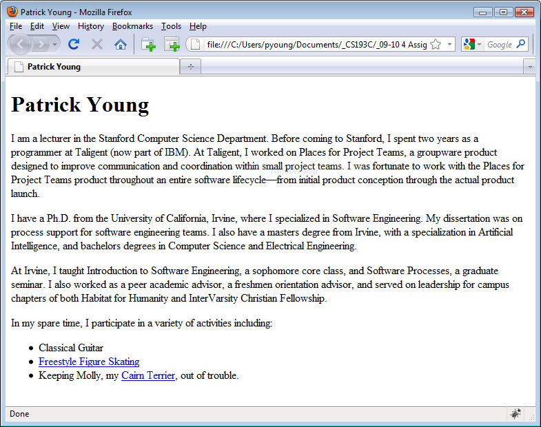
Create a simple personal web page, personal.html, that contains at least the following items:
- Your name at the top of the page as an <h1> heading.
- A few paragraphs about yourself. Be sure to include the word Eastern at least twice in your paragraphs—we’ll need that for the next problem in this assignment.
- A list of hobbies or interest displayed as an HTML unordered list.
- Link at least two of your hobbies or interests to websites related to those interests.
Here’s roughly what the webpage should look like:

Stick to semantic HTML only. (Semantic HTML are those tags that do not specify appearance directly, such as the <i> and <b> tags.) We’ll spice it up with some CSS in the next part of this assignment. You can find a list of HTML elements commonly considered semantic HTML here:
http://microformats.org/wiki/semantic-html
Feel free to add in some additional items to your personal website if you’d like, but there is a more open-ended opportunity to be creative later in the assignment.
Make sure your webpage validates (see the links at the top of this page). Save your file under the name personal.html. If you've not validated a document before, it's very simple. I suggest using the "upload" option, as your html file isn't on a web server yet, and so doesn't have a URL that you can provide to the validators.
Now add a CSS file called personal.css and reference it in your .html file.
Make the following changes and additions:
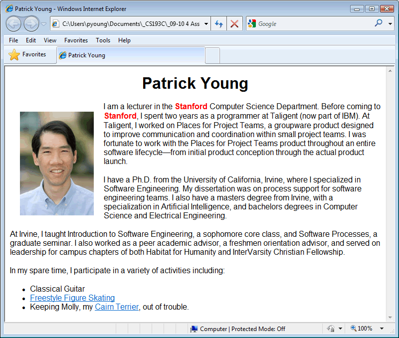
- Add a photograph of yourself and float it to the left side of the webpage using CSS. Add box information (margin, padding, and/or border) to make it look nice on the webpage.
- Change the font used throughout the document to sans-serif. To do this you can set the font for the body element, which will be inherited by all elements contained within the body (which is everything displayed on the webpage). Alternatively, you can create a style rule with the special universal selector which is represented by the asterisk. The universal selector matches any element, however it’s not very efficient and will slow rendering of your page down a bit. For example, the following rule will turn everything on the webpage to red:
  * {
  color: red;
  }
- Center the heading with your name in it.
- Setup your links to use the “:hover” pseudo-class (use a:hover so that only the links are effected). How the link changes when the mouse moves on top of it is up to you, but if you’re short on ideas, just have the link change colors.
- Add <span> tags and setup your style sheet so that every time the word “Eastern” appears, it is in green and is in bold.
Here’s a sample screenshot (in the screenshot "Stanford" is in red, but we want to use "Eastern" in green, instead). Make sure your webpage validates without errors through both the HTML and CSS validators.

Submit your personal.html and personal.css files to the dropbox for this assignment.
Part 2: Zebra Striping (8 points)
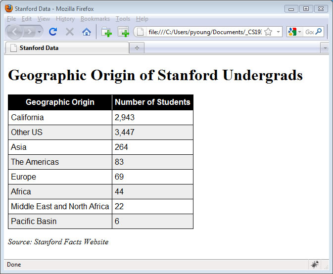
In a zebra-striped table, every other row is a different color. In this problem you’ll create a simple zebra-striped table using data on the Stanford undergraduate population. For this problem save your HTML file under the name zebra.html, and put your CSS directly into the HTML file using the <style> tag. Here is what your webpage should look like:

Your solution needs to display the following characteristics:
- The “Geographic Origin of Stanford Undergrads” heading and the Stanford Facts Website citation at the bottom are in the default serif font, whereas the table itself is in sans-serif.
- The table header row is white text on a black background.
- There is a thin white border separating the “Geographic Origin” cell from the “Number of Students” cell in the table header row.
- Odd-numbered rows (other than the black table header row) have a light gray background whereas even-numbered rows have a white background.
- All table cells (except those in the header) have a 1 pixel solid black border around them.
- The Stanford Facts citation at the bottom should be in italics (but don’t use the <i> italics tag for this, that’s not semantic HTML).
Here are a few implementation pointers.
- You’ll need to use the border-collapse property on the table, otherwise all your table cells will end up with double borders.
- I used the color #EEE for my light gray background.
- For my implementation I created classes for the odd rows and for the last row, but you’re welcome to implement it differently with the following limitation: there is a fancy :nth CSS3 style selector that makes zebra-stripping easy – however, I do not want you to use this. You should get some practice using the class attribute which will be generally useful for a wide range of tasks. If you ever need to zebra stripe a table on a real website, the :nth selector is a fine choice.
Submit your zebra.html file to the dropbox for this assignment.
Part 3: An Example Blog (20 points)
For this problem, modify the file blog.html to use document-level stylesheets so that it is formatted nicely. The document already includes a number of class attributes. You'll need to provide a style for each class attribute. This is your opportunity to get creative on this assignment. Here are the minimum requirements for full credit on this part of the assignment:
- Provide styling on the header and add in the Eastern Seal using an <img> tag with appropriate accompanying CSS to make the seal an appropriate size.
- Make sure that each blog entry is appropriately distinguished, so that a viewer can easily tell where each blog entry starts and stops.
- Add styling to each entry heading and each entry footer.
- Make your sample blog page look good!
I’ll be giving up to 3 bonus points for nicely styled blogs. I'll show the top 1-2 blogs in class. I’ve provided a jpeg of the Memorial Church before the earthquake (from Stanford University Archives) in case you want to add it to your page.
Submit your blog.html file to the dropbox for this assignment.
Part 4: Two Column Layout
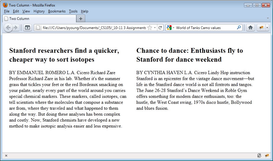
Create following two-column webpage (the text are excerpts from the Stanford Report) using CSS float layout:

Save the file as two-column.html. Each column should be 400 pixels with 15 pixel margins. Use a font with serifs. The actual text is provided with this assignment’s downloads so you don’t have to type it in. This section will not be graded, so you do not need to submit this file.
Part 5: Four Column Layout
Reproduce the following four-column webpage (consisting of headlines from the Stanford Report) using CSS float layout:

Save it under the name four-column.html. Your webpage does not have to look exactly like mine, but it should contain four-columns, each column should be 200 pixels wide with 10 pixel margins. Use a font without serifs. This section will not be graded, and you do not need to submit this file.
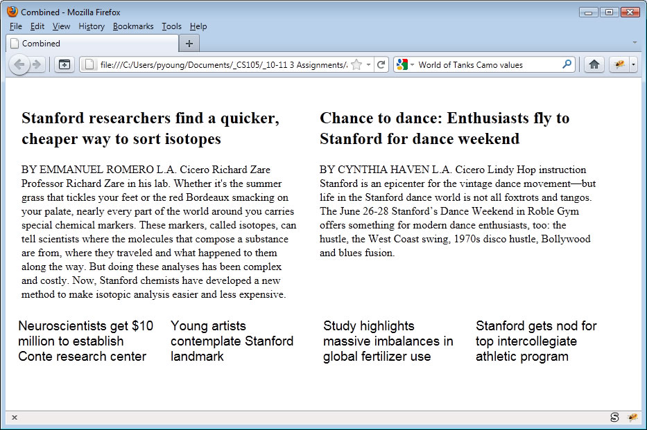
Part 6: Combined Webpage (10 points)
Combine the last two parts of this assignment into a new file called combined.html. Here’s what your combined webpage should look like:

Submit your combined.html to the dropbox.
Part 7: Organizational Web Page (25 points)
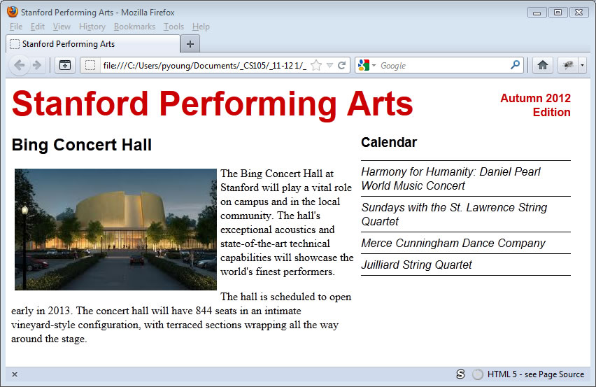
In this part of the assignment we will create a web page, organization.html, containing several layout components, including a header and navigational field.

The Bing Concert Hall text is an excerpt from the actual Bing Concert Hall website (binghall.stanford.edu) and, along with the Bing Concert Hall image file, is provided as part of the homework downloads, so you don’t need to type it in.
Your page doesn't need to be exactly as shown. If your measurements are different or your margins are a bit off or your fonts are a different size, you’ll still receive full credit. But the overall placement of items should be the same. Make sure you have the following features:
- A masthead across the top with “Stanford Performing Arts” on the left and “Autumn 2012 Edition” on the right, right-justified with “Edition” below “Autumn 2012.”
- The main article section on the left with the text floating around the image as shown.
- Calendar section on the right, with performing arts events listed below, with lines between the events plus an additional line between the Calendar heading and the first event and a line below the last event as shown. Use style sheets to create these lines, not the <hr /> tag.
Here are some of the specific measurements used to generate the example web page. Again, you can use different values, so long as the layout is approximately the same.
- “Stanford Performing Arts” color #cc0000, 36 point bold, sans-serif
- “Autumn 2012 Edition” color # cc0000, 12pt bold
- “Bing Concert Hall” 18pt, bold, sans-serif
- “Calendar” 14pt, bold, sans-serif
- Calendar items 12pt, italic, sans-serif
- Article text is default font.
- Overall Width 800px;
- Article Column Width: 500px;
- Calendar Column Width: 300px;
If you use the <h1>, <h2>, and <h3> tags to create your headings (which is recommended), you’ll need to override the standard margins otherwise you headings will take up too much space. This is commonly done on professional webpages. In fact, many professionals use a “CSS Reset” with their webpages, which resets all the margin and padding on all HTML elements to 0px.
Submit your organization.html, along with any image files you reference therein.
Part 8: "Facebook" Page (25 points)
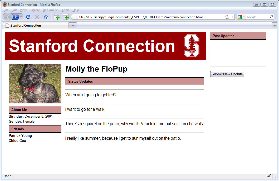
Create the following “Facebook-like” webpage, facebook.html. Here’s what the webpage should look like:

The webpage consists of a photo, some information about the person, and a set of "status updates". On the right, using form elements, the user is able to enter new updates, which will be added to the status updates shown in the center.
You don’t have to make a page for the dog Molly, you can substitute your own information, but don’t spend too much time thinking about this, we're only interested in the webpage layout, not its contents. Also if you enter your own material, make sure it stays at the PG-level or below – I will not grade any R- or X-rated websites.
While you do not need a pixel-perfect implementation you should include the following:
- The "Stanford Connection" banner that runs across the top of the left two columns (but not across the “Post Updates” column.
- As seen in the screenshot the banner should have the Stanford Logo, which is included with the assignments’s downloads. Note that the “Stanford Connection” in the header is text, not part of a graphic image, and it should remain text. You should not create any new graphics files. The color in the logo is #9A0000.
- A column on the left consisting of a picture, followed by information about the user.
- Two sections below the picture, one for “About Me” and one for “Friends”.
- Titles in the “About Me” section like “Birthday” should be bolded, while actual values such as December 8, 2001 are not bolded. Friends’ names are bolded.
- Each of the sections “About Me”, “Friends”, “Status Updates”, and “Post Updates” should have a colored background – the color in the example is #CC9191. They should also have a 2-pixel black border on the top and bottom but no border on the sides.
- Status updates should be separated by thin lines as shown.
- The right column should include a “Post Updates” heading, a text area, and a submission button.
- Leave a reasonable amount of space between columns.
- As we haven't yet discussed how to execute programs with our webpages, the button, “Submit New Update”, won’t actually do anything.
Submit your facebook.html to the dropbox, along with any image files it references.
The following files are provided with the assignment download, assign1Resources.zip:
- blog.html is an enhanced version of the HTML file from class. You’ll need to add your own <style> tag (or a <link> tag and an external file) for the assignment. As previously noted, I’ve also provided you with a Eastern Logo (Emu_seal.GIF) and a photo of Memorial Church from the Stanford University Archives in case you want to add a picture to your blog.
- report-text.txt (unformatted text) for the 2-column/4-column Combined Web Page problem.
- bing.jpg and bing-text.txt (unformatted text) for the Organizational Web Page problem.
- tree-logo.gif and molly.jpg for the Stanford Connection webpage.
