Math 360: Supplementary Thoughts
2015-09-05
Andrew Ross
Math Department, Eastern Michigan University
Contents
The Big Picture (Bigger than Statistics)
The
Big Picture (just inside this class).
Procedural
Advice: CI vs HT, and Controls
Sample
project titles from previous years
Chapter
2.3: Comparative Experiments
Controls:
Positive and Negative
Algorithms
for Computing the Mean and the Variance
Chapter 6.7: Estimating Probabilities Empirically
Using Simulation
Chapter
7.5: Binomial and Geometric
Chapter 8: Sampling Distributions
Confidence Intervals Other Than 95%
Common measures of Effect Size
Big-Picture
skeptical discussion on use of p-values and Hypothesis Testing
Costs of Type I vs Type II error
Reading Prompts for a Concept-based quiz on CI and HT
Testing
by Overlapping Confidence Intervals
What
Data Scientists call A/B Testing
2-sample
z-test for proportions but paired (dependent) rather than independent
Preliminaries
I always want to hear your
thoughts on the class so far, so I created an online form for anonymous
feedback. Please use it to let me know what you think (or if you are not
concerned about anonymity, just send an email) :
https://docs.gooREMOVETHISgle.com/spreadsheet/embeddedform?formkey=dDF2U2djSDAtRmFUM0NsTllmOFJ2ZFE6MQ
You can use this throughout the semester.
You should remove the REMOVETHIS; I just put it in there to deter automated
webcrawlers.
Ethics
The American Statistical Association (ASA) has a statement of Ethical Guidelines for Statistical Practice
The Institute for Operations Research and Management Science (INFORMS) has a Certified Analytics Professional program that includes this Code of Ethics.
And here is a slightly more light-hearted code, originally
written for a financial setting:
Emanuel Derman’s Hippocratic Oath of Modeling
• I will remember that I didn’t make the world and that it
doesn’t satisfy my equations.
• Though I will use models boldly to estimate
value, I will not be overly impressed by mathematics.
• I will never sacrifice reality for elegance
without explaining why I have done so. Nor will I give the people who use my
model false
comfort about its accuracy. Instead, I will make
explicit its assumptions and oversights.
• I understand that my work may have enormous
effects on society and the economy, many of them beyond my comprehension.
Some papers to consider:
Ethical Statistics and Statistical Ethics: Making an
Interdisciplinary Module
Critical Values and Transforming Data: Teaching Statistics
with Social Justice
And a report on how web sites return different search
results, prices, or ads based on the apparent race or location of the searcher:http://www.wnyc.org/story/dba2f97dd61e2035fd433a48/?utm_source=/story/128722-prime-number/&utm_medium=treatment&utm_campaign=morelikethis
searching for a traditionally black-sounding
name such as “Trevon Jones” is 25 percent more likely to generate ads
suggesting an arrest record—such as “Trevon Jones Arrested?”—than a search for
a traditionally white-sounding name like “Kristen Sparrow,” according to a January
2013 study by Harvard professor
Latanya Sweeney. Sweeney found this advertising disparity even for names in
which people with the white-sounding name did have a criminal record and people
with the black-sounding name did not have a criminal record.
And later in the report,
Our tests of the Staples website showed that
areas with higher average income were more likely to receive discounted prices
than lower-income areas.
The Big Picture
(Bigger than Statistics)
Statistics is its own field, of course, but it is related to many others. People now talk about Analytics, which is often broken into
· Descriptive Analytics: what did happen? (EMU Math 360)
· Predictive Analytics: what will happen? (EMU Math 360, EMU Math 419W)
· Prescriptive Analytics: what’s the optimal thing to do? (EMU Math 319, EMU Math 560)
Some people summarize this as Describe, Anticipate, Decide = D.A.D.
Of course other EMU statistics courses relate to Descriptive and Predictive analytics; I’ve only listed the ones I teach.
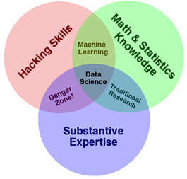
“Data Science” is another hot term these days. Some say it’s a combination of Statistics/Math/Operations Research, Computer Science, and Substantive Expertise:
http://drewconway.com/zia/2013/3/26/the-data-science-venn-diagram
The book “Doing Data Science”, page 42, says "Now the key here that makes data science special and distinct from statistics is that this data product then gets incorporated back into the real world, and users interact with that product, and that generates more data, which creates a feedback loop."
I disagree with that on two levels: first, plenty of people do what they’d call data science that doesn’t interact with users/create a feedback loop, and second, the idea of interaction or creating a feedback loop could still be called statistics, or Advanced Analytics/prescriptive analytics.
“Big Data” is also a hot topic these days. You could say it is any data set that is too big to fit onto one computer, and must be split across multiple computers. For example, Facebook profiles and clickstreams would constitute big data; some physics experiments also generate big data (100 TB per day!) Big data is often characterized by the “3 V’s”: Volume, Velocity, and Variety. Volume means how much data there is, Velocity means how fast it comes in, and Variety is the mix of numbers, text, sounds, and images. We won’t be dealing with Big Data in this class, but ask me if you want to know more about it.
The Big Picture (just inside this class)
We will use Excel a lot, even though there are well-documented problems with it for statistics; for example,
http://panko.shidler.hawaii.edu/SSR/Mypapers/whatknow.htm
http://www.analyticbridge.com/profiles/blogs/comprehensive-list-of-excel-errors-inaccuracies-and-use-of-wrong-
Concept maps of Statistics
http://derekbruff.org/blogs/math216/?p=675
http://bioquest.org/numberscount/statistics-concept-map/
http://iase-web.org/documents/papers/icots6/5a2_bulm.pdf
http://cmapskm.ihmc.us/rid=1052458963987_1845442706_8642/Descriptive%20statistics.cmap
http://cmapskm.ihmc.us/servlet/SBReadResourceServlet?rid=1052458963987_97837233_8644&partName=htmltext
http://www.sagepub.com/bjohnsonstudy/maps/index.htm
Eight Big Ideas
1. Data beat anecdotes
2. Association is not causation
3. The importance of study design
4. The omnipresence of variation
5. Conclusions are uncertain.
6. Observation versus experiment
7. Beware the lurking variable [confounding]
8. Is this the right question?
http://www.statlit.org/pdf/2013-Schield-ASA-1up.pdf
What Your Future Doctor Should Know About Statistics: Must-Include
Topics for Introductory Undergraduate Biostatistics
Brigitte Baldi & Jessica Utts
Pages: 231-240
DOI: 10.1080/00031305.2015.1048903
What do Future Senators, Scientists, Social Workers, and Sales Clerks Need to Learn from Your Statistics Class? http://www.ics.uci.edu/~jutts/APTalk.pdf
1. Observational studies, confounding, causation 2. The problem of multiple testing 3. Sample size and statistical significance 4. Why many studies fail to replicate 5. Does decreasing risk actually increase risk? 6. Personalized risk 7. Poor intuition about probability/expected value 8. The prevalence of coincidences 9. Surveys and polls – good and not so good 10. Average versus normal
Math Is Music; Statistics Is Literature
Richard D. De Veaux, Williams College, and Paul F. Velleman, Cornell University
S even unnatural acts of statistical thinking:
➊ Think critically. Challenge the
data’s credentials; look for biases and lurking variables.
➋ Be skeptical. Question authority
and the current theory. (Well, okay, sophomores do find this natural.)
➌ Think about variation, rather than
about center.
➍ Focus on what we don’t know. For
example, a confidence interval exhibits how much we don’t know about the
parameter.
➎ Perfect the process. Our best
conclusion is often a refined question, but that means a student can’t memorize
the ‘answer.’
➏ Think about conditional
probabilities and rare events. Humans just don’t do this well. Ask any gambler.
But, without this, the student can’t understand a p-value
7 Embrace vague concepts. Symmetry, center, outlier, linear … the list of concepts fundamental to statistics but left without firm definitions is quite long. What diligent student wanting to learn the ‘right answer’ wouldn’t be dismayed?
Statistics Habits of Mind http://info.mooc-ed.org.s3.amazonaws.com/tsdi1/Unit%202/Essentials/Habitsofmind.pdf
● Always consider the context of data ● Ensure the best measure of an attribute of interest ● Anticipate, look for, and describe variation ● Attend to sampling issues ● Embrace uncertainty, but build confidence in interpretations ● Use several visual and numerical representations to make sense of data ● Be a skeptic throughout an investigation
Proposal/Project Guidance
For project proposals, a few
things to remember:
* I encourage team projects, but solo projects
are allowed as well.
* Team sizes are limited to 2
people (arranged with whomever you want).
* if anyone is looking for a partner, please let me know and I will do my best to play eHarmony.
* There is no competition for
project topics. Multiple people or teams may do the same project.
* I STRONGLY ENCOURAGE you to chat with me about
project ideas well before the proposal deadline, either in person or by email.
* After the chatting is done, feel free to email
me a draft of a proposal (and perhaps a data set) for some informal feedback.
* See below some sample project titles from last
year's Math 360 class.
Proposals
Proposals will generally be 1 to 2 pages, and
will contain:
* title of project
* author(s) names
* a description of the problem you are facing
* a description of the available data or data
collection plans (incl. a copy of the data if it’s already available, perhaps
as a separate file)
* a description of the proposed analysis
* literature search? for many projects, no
literature search is needed. Others may benefit from a literature search, and
may get bonus points for doing one. Giving proper credit to your sources of
information or ideas is always required.
* data? If you already have the data, include a
spreadsheet of it as a 2nd file when you upload the presentation
If your project idea depends on getting a data
set from your boss at work, you need to have the data set in hand by the time
of the proposal. I've had a few projects go bad when a boss doesn't come
through with promised data.
A proposal does not lock you in to a topic or
analysis method. If your project is not working out, contact me immediately and
together we will find a new project topic.
Procedural Advice: CI vs HT, and Controls
A general tip as you're doing your projects: doing confidence intervals is almost always better than doing a hypothesis test, because a CI can be converted into an HT very easily in your head (did the CI include zero? for example), but knowing the results of an HT doesn't give you much info about the related CI. There are some projects where a CI isn't applicable, though--often those related to Chapter 12 (chi-squared tests). The one nice thing about HT, though, is that you get a P-value, while the CI just lets you know that it was < 0.05 or whatever value you used for a CI.
It's important to create
artificial data sets similar to what your real data set is. That way, when you
do your processing, you can tell if you are getting what you expect to
get--it's a way of debugging. You start by copying the file with your original data
set, then in that copy, replacing the original data with artificial data. Then
you do your analysis on the artificial data. Once you've done it for artificial
data, you should be able to save another
copy of that file, then paste your real data in where the artificial data is,
and have all the calculations automatically update. This is vastly better than
trying to re-create the formulas in a new sheet, since that could introduce new
bugs.
To generate a Standard Normal in excel, use
=norminv(rand(),0,1)
To generate a non-standard normal with mean 5 and std.dev. 3, use
=norminv(rand(),0,1)*3 + 5
Another big advantage of creating artificial
data is then you can compute how much your output measurements change just due
to random chance, by running a whole bunch of random trials.
Someone asked me if the
random number generator in Excel is seedable (that is, can it be set to start
at the same sequence over and over). There's no interface for doing that, but I
researched the algorithm that the random number generator uses, and I've
implemented it in simple formulas in a posted spreadsheet. You may ignore this
if you want.
Another key component of some
projects is the idea of Cross-Validation. Instead of fitting models to the
entire data set, you pick a portion of it called the “Training” set and fit the
models to that. Then you use those fitted models to make predictions for the
rest of the data, called the “Test” set, to see which model does the best.
Actually, if you then want to quantify the prediction errors you might expect
to see, you need a 3rd portion of the data set: you fit the winning
model to the training & test set, then make predictions for that 3rd
portion, and measure the prediction error.
Doing Data Science says:
In-Sample,
Out-of-Sample, and Causality
We need to establish a strict concept of in-sample and out-of-sample data. Note
the out-of-sample data is not meant as testing data—that all happens inside in-sample data. Rather, out-of-sample data is
meant to be the data you use after finalizing your model so that you have
some idea how the model will perform in production. We should even restrict the
number of times one does out-of-sample analysis on a given dataset because, like it or not, we learn stuff about that data every
time, and we will subconsciously overfit to it even in different contexts, with
different models.
Next, we need to be careful to always perform causal modeling (note this
differs from what statisticians mean by causality). Namely, never use
information in the future to predict something now. Or, put differently, we
only use information from the past up and to the present
moment to predict the future. This is incredibly important in financial modeling. Note it’s
not enough to use data about the present if it isn’t actually available and
accessible at the present moment. So this means we have to be very careful with
timestamps of availability as well as timestamps of reference. This is huge
when we’re talking about lagged government data.
Final Report
Your final report should be a roughly 5-to-10-page technical
report (a Word file, usually). I don’t count pages, though, so don’t worry
about the exact length. Please use the
HomeHealthCare.doc file that I will email out as a template (remove their
content, type in your own content).
Please upload both your
report file and your Excel file at the same time. But, your report should have
copies of any relevant figures; don't just say "see the Excel file".
If you are part of a team project, _each_ person
should upload a copy of the presentation and report.
Presentations
For your final presentation, you have 2 options:
· A 5-minute Powerpoint-style presentation that you stand up and give to the class (roughly 5 slides), or
· A poster presentation, which often consists of about 12 Powerpoint slides, printed out on paper and taped to the wall of the classroom (don’t buy/use posterboard).
Each person or team of 2 may decide whether they want to do a poster or oral presentation. Either way, presentation materials should be uploaded to a dropbox inside EMU-online.
Please do not feel obligated
to dress up for our presentation day in Math 360. Anyone who does dress up will
be a few standard deviations from the mean, as statisticians say. Either way,
it will not affect your grade at all.
However, it is important to present in a professional way (aside from how you are dressed). If I write a letter of recommendation for you, I want to be able to say how polished your presentation was—not just your slides, but your manner of speaking. This can be especially important for future teachers. In a letter of recommendation I would hope I could say “While I’ve never observed ____ as they teach an actual class, their final project presentation in Math 360 convinces me that they have the presentation skills to be a great teacher.”
National Competition
I will recommend that some people submit their
work to the Undergraduate CLASS Project Competition (USCLAP)
http://homepages.dordt.edu/ntintle/usproc/USCLAP.htm
The writeup for that has the following page
limits (all in 11-point Arial, single-spaced, 1-inch margins):
1 page for title and abstract
<=3 pages for report
1 page for bibliography, if any (optional)
<=5 pages for appendices
So you might want to format
your paper that way if you’re thinking of entering the contest.
Note that if you are using
data from human subjects (or animals!) you will need to apply for permission
from EMU’s Institutional Review Board (IRB) to use your data in the USCLAP contest.
I can help you with this, but we need to do it early in the semester. If you
aren’t hoping to submit to the USCLAP, then IRB approval is usually not
required.
The judging criteria for that contest will be
the basis of the grading system for projects:
1. Description of the data source (15%)
2. Appropriateness and correctness of
data analysis (40%)
3. Appropriateness and correctness of
conclusions and discussion (20%)
4. Overall clarity and presentation (15%)
5. Originality and interestingness of the
study (10%)
NOTE: All essential materials addressing these
criteria must be in the report, not confined to the spreadsheet file.
You can see the guidelines I give to my other
project-based classes (Math 319, Math 419, Math 560) at this link:
http://people.emich.edu/aross15/project-guides/guides.html
though as you can see from the above, the
requirements for Math 360 are a little different because of the statistical
focus.
Also see:
Heiberger, Richard M., Naomi B. Robbins, and Jüergen
Symanzik. 2014. "Statistical Graphics Recommendations for the ASA/NCTM
Annual Poster Competition and Project Competition", Proc. of the Joint
Statistical Meetings, American Statistical Association, Arlington, VA.
Symanzik, Jüergen; Naomi B. Robbins, Richard M.
Heiberger. (2014). "Observations from the Winners of the 2013
Statistics Poster Competition --- Praise and Future Improvements." The
Statistics Teacher Network, 83, 2-5.
Sample project titles from previous years
Baseball player builds and home runs
Tennis serve accuracy
Noll-Scully simulation of sports rankings
Spring Training vs Regular Season
Anchoring effect
Finding a Piecewise Linear Breakpoint in Chemistry
data
Music participation and GPA
double-SIDS dependencies
Swimming times
Salary vs. Results in NCAA Tournament
NBA scores
Barbie Bungee Challenge
Incumbency advantage in elections
Comparing Distinct Audio Points in Classical and
Rock Music
Barbie Bungee Challenge
Airbags, seat belts, bike helmets
Spring Training vs Regular Season
Golden Ratio in Art
Gender differences in SAT scores
Home health care data
double-SIDS dependencies
GEAR-UP survey data
Normal distributions on Wall Street?
NBA scores
Naive Bayesian spam filtering
Honors college GPAs
Predicting Course Grades from Mid-Semester
Grades
Anchoring effect
Salary vs. Results in NCAA Tournament
Incumbency advantage in elections
An Analysis of Correlations between Event Scores in Gymnastics Using Linear Regression
Accounting Fraud and Benford's Law
Appointment-Based Queueing and Kingman's Approximation
Are Consumers Getting all the Coconut Chocolaty Goodness They’re Paying For?
Are regular M&Ms more variable in weight than Peanut M&Ms?
Barbie Bungee Experiment
Breaking Eggs in Minecraft
Calculus-Based Probability
Comparing the Efficiency of Introductory Sorting Algorithms
Distribution of File Sizes
Do students who score better on a test’s story problems score better on the test as a whole?
Do studying Habits affect your interest in math
Do young adults under 18 and 18 and older have the same completion rate of the 3-shot regimen for Gardasil?
Does age effect half-marathon completion time
Patterns in bulk discounts
Does having high payrolls mean you will win more Major League Baseball games?
Gardasil 3-shot vaccine completion, average number of shots
Getting Hot at the Right Time: A statistical analysis of variable relative strength in the NHL
Home Field Advantage in MLB, NFL, and NBA
How random are Michigan Club Keno and Java random numbers?
Ice Cream Sales and Temperature
Is there relationship between the length of songs at the #1 spot on the Billboard Hot 100 and their respective week at #1 in time?
Lunch vs Dinner Sales at Domino's
Math Lab demand data vs Section Enrollment by Hour
Modeling School of Choice Data in Lenawee County
Pharmacy prescription pick-up times
Piecewise-Linear Regression on Concentration / Conductivity Data
Proportion & Probability of 2-Neighborly Polytopes with m-Vertices in d-Dimensions
Ranking Types of Math Questions (Algebra-based)
Scoring Trends and Home Court Advantage in Men’s College Basketball
Skip Zone on the Sidewalk
Spaghetti Bridge and Pennies
What affects a pendulum’s behavior
Project Ideas
While these are shown in various categories, each project idea is open to anyone in any major.
Miscellaneous
Are stock prices (or percent returns) normally distributed? See http://bestcase.wordpress.com/2010/08/01/outliers-in-the-nyt-reflections-on-normality/
Various questions on where the Daily Double in Jeopardy is located (ask me for more thoughts)
Song database: http://musicbrainz.org/doc/MusicBrainz_Database
correlation between LSAT, GPA, admission, and salary; ask me to dig the data out of my email if needed
Fermat's last theorem histogram: how close can the equation come to being true?
* Mega M&Ms claim they have
"3x the chocolate per piece"
* What is the speed of the wave as dominoes
tumble in a row, as a function of the spacing between them? Is it a linear
function?
* If people close their eyes and balance on one
foot, how long can they stay up? Does it depend on which foot they stand on,
vs. their handedness?
* If you do some moderate exercise then track
your pulse after you stop, does it go back to your resting pulse in a linear
fashion? exponential? power?
* psychology/occupational therapy: learning
curves,
http://web5.uottawa.ca/www5/dcousineau/home/Research/Talks/2001-06_BBCS/2001-06_BBCS-learning.pdf
* Does the "close door" button on elevators
actually do anything?
* which packs more efficiently, plain M&Ms
or spheres?
* burning birthday candles,
http://www.algebralab.org/activities/activity.aspx?file=Science_BurningCandles.xml
http://www2.drury.edu/fred/activities/candles/candle.html
* can you do anything with the loud hand driers
in the Pray-Harrold bathrooms?
* as you add layers of tape (or post-it notes?) over
the camera of an iPhone/iPad/Android, how does the total light transmitted to
the camera vary?
* How long a toaster takes vs. the control
setting (or, how dark the toast gets?)
* how fast does water flow out of
an I.V. (intravenous fluid) bag, based on how high the bag is to where the
outflow is?
Economics
https://en.wikipedia.org/wiki/Cliometrics
Cliometrics is the study of history and economics using mathematical methods.
* business cycle durations and/or models; see http://onlinelibrary.wiley.com/doi/10.3982/ECTA8050/abstract?elq_mid=4373&elq_cid=1272383
* How much seasonal effect is there in things like inflation,
stock prices, stock indices, etc.?
- try this: separate data into months, do
ANOVA to see if there's a difference between months (or use quarters)
- should you operate on the actual value,
or the % change, or Ln( new/old ) ?
- or try triple-exponential smoothing
(also called Holt-Winters) and see what seasonal effects it finds
- also use artificial data that has no
seasonality, and artificial data that definitely does have seasonality
* How much correlation is there from day to day
(or week to week, or month to month, or year to year, or hour to hour, or
minute to minute, etc.) in inflation, stock prices, stock indices, etc?
- should you operate on the actual value,
or the % change, or Ln( new/old ) ?
* Do stock prices, etc. have a Normal distribution?
- should you operate on the actual value,
or the % change, or Ln( new/old ) ?
- if the data is correlated from day to
day, consider taking data from separate days rather than adjacent days.
- use the correlation coefficient on a Q-Q
normal probability plot as a way to do a hypothesis test (see that part of the
textbook for details--chapter 7)
* explore Hyperbolic Discounting: the way actual
people might (or might not) treat the value of money in future time periods. Do
a survey and ask how much money people would trade now for a specified payoff
in the future, then fit a function to it. Also, there is a hypothesis that
one's native language can have an effect (or is at least correlated with) on
how one views the value of future money, so consider separating results by the
person's native language.
Various data is at
http://www.econlib.org/library/sourcesUS.html
Physics
toy helicopter lift force vs rotation speed http://sphsdevilphysics.weebly.com/uploads/5/0/7/1/5071691/example02_en.pdf
GPS accuracy:
- by time of day
- by weather/day-to-day
- within span of a few seconds or minutes
- from device to device
Tablet/Smartphone Accelerometer Data:
- accuracy at 500 Hz vs 50 Hz vs 5 Hz
- correlation between devices
Mars Craters data set,
craters.sjrdesign.net
Make your own crater data set
with a bucket of sand and a heavy marble?
cepheid variable stars; ask
me to dig data out of my email box
Asteroid size distribution: can get data from http://www.asterank.com http://www.minorplanetcenter.net/iau/lists/Dangerous.html
http://earn.dlr.de/nea/table1_new.html
http://earn.dlr.de/nea/
http://www.space.com/30197-saturn-rings-math-rule.html?cmpid=514630_20150815_50643176&adbid=10153004255456466&adbpl=fb&adbpr=17610706465 and http://www.pnas.org/content/112/31/9536
Size distribution of particles in Saturn’s rings
from aggregation and fragmentation
Nikolai Brilliantov , P. L. Krapivsky , Anna
Bodrova, Frank Spahn, Hisao Hayakawa, Vladimir Stadnichuk, and Jürgen Schmidt
space weather, Coronal Mass
Ejections CME (ask me to dig up some data on this out of my emails)
There’s a new ASA section on
astrostatistics, described in AMstat News—see what they do?
http://en.wikipedia.org/wiki/Proton_decay In an experiment involving a series of particle collisions,
the amount of generated matter was approximately 1% larger than the amount of
generated antimatter. The reason for this discrepancy is yet unknown.[2]
V.M. Abazov et al. (2010). "Evidence
for an anomalous like-sign dimuon charge asymmetry". arXiv:1005.2757. http://arxiv.org/abs/1005.2757
Future Teachers
Tennessee STAR study on small
class sizes
problems with estimating from pie charts
parents probability of pulling kids from public
schools (survey)
Regression through the origin: when?
Instead of a regular project, work on getting
the Data Analysis electronic badge?
anchoring effect
Barbie Bungee: make a bungee-cord out of rubber bands, and
send a Barbie (or similar toy) plunging toward the floor. Try it with a few
different lengths of cord, record how far she plunges, then forecast how many
rubber bands would be needed for a 12-foot drop. You can find more info online,
of course.
Spaghetti Bridges: make a simple bridge of straight spaghetti (not glued into a
truss), see how much weight it can hold. Repeat with wider spans and/or more
strands per bridge. You can find more info online. One reference is
“Slope-Intercept Form—Beam Strength” from Exploring Algebra 1 with TI-Nspire,
2009, Key Curriculum Press.
Pullback Cars
* How far does a supersoaker shoot, based on how many pumps
you give it?
* How far does a supersoaker shoot, as a function of time as you hold down the
trigger?
Statistics Majors
Here are some ideas about the
mechanics of statistics:
LiveRegression formulas
Confidence interval on s_e for linear regression
Partial Correlation in multivariate analysis
Simulate a thought experiment on publication bias
advanced work on causality: http://magazine.amstat.org/blog/2013/08/01/causality-in-stat-edu/
Judea Pearl work on causality
Bayesian networks
Granger causality
Computer Science
Consider reading “Statistical Modeling: The Two
Cultures”, which talks about the divide between traditional statistical methods
and “machine learning” methods:
https://projecteuclid.org/download/pdf_1/euclid.ss/1009213726
Machine Learning problems:
logistic regression, SVM, etc.
Cross-Validation: training
and test data sets
Queueing simulation in Python
(using existing code from Prof. Ross)chi
distribution of file sizes
- on a hard drive (correlated to time of
creation, modification, or access?)
- on a web server
- as requested from a web server
distribution of packet sizes, and correlation
from one to the next?
distribution of time gap between packets, and correlation from one to the next?
spam filtering; try the Enron email database at http://www.cs.cmu.ed/~enron
durations of jobs on the CPU
memory sizes of jobs
paging policies
Network round-trip times for
pings
Sleep vs Cron repetitive
wakings
look into what gets presented at ACM SIGMETRICS
http://sciencehackday.pbworks.com/w/page/24500475/Datasets
http://aws.amazon.com/datasets?_encoding=UTF8&jiveRedirect=1
http://www.cs.cmu.edu/~awm/15781/project/data.html
Health care
Medicare Home Health Compare
Gardasil data set:
http://www.amstat.org/publications/jse/v19n1/gardasil.txt
SEER cancer data set,
http://seer.cancer.gov/
(need to submit application to use it)
National Longitudinal Study
of Adolescent Health, via IPCSR/umich (easiest to use wave 1)
Health Evaluation and Linkage
to Primary Care (HELP), data set HELPrct from Project Mosaic
painkiller prescription and overdose rates by state; I have some of the data saved in an email
Sports
Pick your favorite sport and
ask a statistical question about it. Some examples:
* predicting player performance from
previous years (helpful first step to choosing a fantasy team)
* quantifying home-field advantage
* (harder) quantifying time-zone advantage
* bracketology
How consistent is a participant's
performance (#fish? weight? rank? z-score?) from one event in the tour to the
next? Compare to other individual-performance sports? Here are links for 3
tournaments in 2014:
http://www.flwoutdoors.com/bassfishing/flw/tournament/2014/7128/kentucky-lake-paris-landing-professional-results/?dpl=1&all=1&sr=1&rpp=50&&sort=pl
http://www.flwoutdoors.com/bassfishing/afs/tournament/2014/7134/potomac-river-professional-results/?dpl=1&all=1&sr=1&rpp=50&&sort=pl
http://www.flwoutdoors.com/bassfishing/afs/tournament/2014/7135/lake-champlain-professional-results/?dpl=1&all=1&sr=1&rpp=50&&sort=pl
How about the Hot Hand?
http://regressing.deadspin.com/the-myth-of-the-myth-of-the-hot-hand-1588112937
http://www.nytimes.com/2014/06/26/science/the-science-of-hot-hand.html?referrer=&_r=2
http://andrewgelman.com/2014/03/11/myth-myth-myth-hot-hand/
Here is a stats textbook that has a sports focus, rather
than just doing sports-statistics, but it might still be interesting: http://www.sportsci.org/resource/stats/index.html
Related books and
Websites
Statistical
Applets:http://sapphire.indstate.edu/~stat-attic/index.php?topic_id=HT
GeoGebra can do some statistics: http://web.geogebra.org/beta/
use
the three-bar button in the upper right
choose Perspectives
choose Spreadsheet&Graphics
click on the normal curve with an area under it
Play with either the Distribution or the
Statistics tab
Statistics can do Z Test of a Mean, T Test
difference of means, etc.
Excel 2010 for educational
and psychological statistics : a guide to solving practical problems / Thomas
Quirk.
Excel 2010 for biological and life sciences
statistics : a guide to solving practical problems / by Thomas J. Quirk, Meghan
Quirk, Howard Horton.
Converting Data into Evidence
A Statistics Primer for the Medical Practitioner
DeMaris, Alfred, Selman, Steven H.
Statistics with Excel website:
http://www.real-statistics.com/
Little Handbook of Statistical Practice
http://www.jerrydallal.com/LHSP/LHSP.HTM
http://www.stat.berkeley.edu/~aldous/Real-World/draft_book.pdf
On Chance and Unpredictability: 13/20 lectures
on the links between mathematical probability and the real world. David Aldous,
January 2012
Statistical
Reasoning in Sports, by Tabor and Franklin http://bcs.whfreeman.com/sris/
http://content.bfwpub.com/webroot_pubcontent/Content/BCS_5/SRIS/Student/Appendices/AppB_Using_Excel.pdf
Statistics: A Guide to the
Unknown
Forty Studies that Changed Psychology:
Exploration into the History of Psychological Research
"Making Sense of
Data" volumes 1,2,3, by Glenn J. Myatt; EMU library has an electronic
subscription
Doing Data Science: Straight
Talk from the Frontline, By Cathy O'Neil, Rachel Schutt; Publisher: O'Reilly
Media
Chapter 1
We will use this
link for the Car Insurance activity:
https://docs.gooREMOVETHISgle.com/spreadsheet/embeddedform?formkey=dEV4M2hZanFqRlByRVRadWJiZTFQd3c6MQ
and then later we will use this link for the
Data Types activity:
https://docs.gooREMOVETHISgle.com/spreadsheet/embeddedform?formkey=dERFS3VncWZHbUZMNnVVcnJwcXltYlE6MA
Some additional reading is included below.
To prepare for our next class, we will use the following PDF file
on Random Rectangles:
http://www.rtmsd.org/cms/lib/PA01000204/Centricity/Domain/197/RandomRectangles.PDF
and you should enter your answers here before
class starts:
https://docs.gooREMOVETHISgle.com/spreadsheet/embeddedform?formkey=dHN0SlctaDFNaTY2QWctS3RraHJZbWc6MQ
Data
Types
Sometimes we code binary categorical variables (like gender) as 0 or 1;
that’s called Dummy coding. We can also code them as -1 vs +1; that’s called Effect
coding: http://methodology.psu.edu/node/266
Here is some reading on the standard
classifications for Data Types (nominal, ordinal, interval, ratio):
http://www.upa.pdx.edu/IOA/newsom/pa551/lecture1.htm
http://en.wikipedia.org/wiki/Level_of_measurement
and an opposing viewpoint:
www.cs.uic.edu/~wilkinson/Publications/stevens.pdf
which cites, among other possible systems,
Mosteller and Tukey (1977 Chapter 5):
* Names
* Grades (ordered labels such as Freshman,
Sophomore, Junior, Senior)
* Ranks (starting from 1, which may represent
either the largest or smallest)
* Counted fractions (bounded by zero and one.
These include percentages, for example.)
* Counts (non-negative integers)
* Amounts (non-negative real numbers)
* Balances (unbounded, positive or negative
values).
Doing Data
Science, page 23, suggests:
• Traditional: numerical, categorical, or binary
• Text: emails, tweets, New York Times articles
• Records: user-level data, timestamped event data, json-formatted log
files
• Geo-based location data
• Network
• Sensor data
• Images
Also see http://stats.stackexchange.com/questions/539/does-it-ever-make-sense-to-treat-categorical-data-as-continuous
For future teachers: I
was amazed to see in my daughter's 3rd grade homework a link with our
Categorical/Quantitative, Discrete/Continuous discussion:
This homework sheet talks about Count, Measure, Position, and Label:
http://www.eduplace.com/math/mw/practice/3/homework/1_1.pdf
This one is amazingly similar to our activity where we talked about
Nominal, Ordinal, Interval, Ratio for our start-of-semester-survey:
http://www.eduplace.com/math/mw/practice/3/enrichment/1_1.pdf
I'm not sure if it's in all such curricula--the book they're using is by
Houghton Mifflin.
Dotplots
Remember that dotplots can
tell us:
* S: the Shape of the
distribution: (concentrated at an endpoint? Or in the middle?
* O: any Outliers or other unusual features like
gaps
* C: where the data is Centered
* S: how Spread the data is (or as some call it,
Variability)
so if you're writing sentences describing a
dotplot, you should write at least one sentence for each of those bullet
points. Remember the acronym SOCS. It’s important to do them in that order,
too, because shape and outliers often influence our choice of how to measure
center and spread.
For example, for a sibling-count dotplot we did
one year in class:
The data is concentrated near
the low end.
There are no unexpected gaps or outliers.
The center of the data is around 3.
The data is spread from 1 to 9.
A more subtle concept is
“Inlier”, like an outlier in the sense that it might be a false reading, but it
doesn’t fall outside the main data range. A common example is for missing data
to accidentally be represented by a zero, when small numbers like zero or 1 or
2 are in fact perfectly plausible real data values.
Lexical ambiguity: making a case
against spread
Jennifer J. Kaplan1, Neal T. Rogness2 and Diane
G. Fisher3
Article first published online: 28
APR 2011
DOI: 10.1111/j.1467-9639.2011.00477.x
http://onlinelibrary.wiley.com/doi/10.1111/j.1467-9639.2011.00477.x/full
That article says that “variability” is a better word.
Population and
Sample
First, let’s note that in
statistics, a Sample almost always means more than one data value. If you poll
25 people for a project, that is a single Sample, not 25 samples. This is in contrast
to how scientists often think of samples: a blood sample, or a sample from a
lake or river, often makes us think of just one container of blood or water.
Doing Data Science, page 21,
asks:
But,
wait! In the age of Big Data, where
we can record all users’ actions all the time, don’t we observe everything? Is
there really still this notion of population and sample? If we had all the
email in the first place, why would we need to take a sample?
And on page 25:
The
way the article frames this is by claiming that the new approach of Big Data is
letting “N=ALL.”
Can N=ALL?
Here’s the thing: it’s pretty much never all. And we are very often missing the
very things we should care about most.
Chapter 2
Example of Sampling Frames: 3 different lists of all doctors in a country
optimal
assignment instead of random assignment:
http://pubsonline.informs.org/doi/pdf/10.1287/opre.2015.1361
Dimitris Bertsimas, Mac Johnson, Nathan Kallus
(2015) The Power of Optimization Over Randomization in Designing
Experiments Involving Small Samples. Operations
Research 63(4):868-876. http://dx.doi.org/10.1287/opre.2015.1361
Confounding
Confounding vs Lurking:http://www.virmanimath.com/start-page-2012-2013/ap-stats-2012-2013/chapter-2/apstatonlineclass/confounding-and-lurking-variables
Example of confounding: Stereotypically, old people are thought of as not very good with new technology. Is that because they have lived a large number of years, or because they were born during a particular decade or two? There’s no way to disentangle those two things.
Another example: An
exhibit at the Wagner farm in Glenview, IL has 3 rope/pulley systems, each
trying to lift an equal weight. One is a simple pulley; the next is compound
(down and up), the 3rd is even more compound (down/up/down). The ropes used are
also slightly different: the most compound one uses a thinner rope. The most
compound one should be the easiest to pull. [it's not, due to a lack of
lubrication and some bent axles on the pulleys).
My daughter tries all 3 and decided that the diameter of the rope is what makes
things easier or harder to lift.
Another example: Examining
Variation in Recombination Levels in the Human Female: A Test of the
Production-Line Hypothesis; Ross Rowsey, Jennifer Gruhn, Karl W. Broman,
Patricia A. Hunt, Terry Hassoldemail, http://dx.doi.org/10.1016/j.ajhg.2014.06.008
and
With
Gene Disorders, The Mother's Age Matters, Not The Egg's
Also, I heard this somewhere: Women who have more kids tend to have started at an earlier age than women that have fewer kids. So if you're looking for the relationship between that and breast cancer, which one is the main effect?
Imagine dropping a marble into a
bucket of sand and measuring the diameter of the crater.
If you change the diameter of the impactor,
you're also changing the weight (or vice versa), unless you take very great
care to find marbles/balls that change density or become hollow in just the
right way.
The table would look like this:
Diameter Weight DropHeight
CraterSize
0.5cm 2grams
25cm 5cm
0.5cm 2grams
25cm 6cm
0.7cm 3grams
25cm 7.1cm
0.7cm 3grams
25cm 7.3cm
You could control weight separately from
impactor diameter by using a non-sphere impactor, like a stack of pennies or
nickels, or AA batteries. But then you'd have to be careful to control its
orientation at impact--maybe have it slide down a V-shaped near-vertical
channel, or suspended from a string (balanced perfectly vertically) and very
still, then cut the string.
Activity
Quick activity: name that
sampling method
a. Roll a die to pick a row in class, then ask
each student in that row; do it twice
b. Pick a student and then every 5th student
after that
c. Ask one student from each row
d. pick some students, say "you guys look
like typical students"
e. throw an object, see who it hits
f. Number the students, etc.
In _______ sampling, ALL groups (strata?
clusters?) are used, and SOME individuals in each are sampled.
In _______ sampling, SOME groups (strata?
clusters?) are used, and ALL individuals in each are sampled.
If you’ve done Stratified sampling, how do you combine your strata results into whole-sample results? Ask me for a photocopy from Applied Statistics for Engineers and Scientists, 2nd Edition, by Devore and Farnum.
Kate Crawford’s talk, Algorithmic Illusions: Hidden Biases of Big Data
Dotplots of Random Rectangles results, look for
bias
Bias in cancer screening: Crunching Numbers: What Cancer Screening Statistics Really Tell Us, by Sharon Reynolds, http://www.cancer.gov/ncicancerbulletin/112712/page4
Bias due to question ordering: http://textbookequity.org/oct/Textbooks/Lippman_mathinsociety.pdf
page 137: A psychology researcher provides an example:
“My favorite finding is this: we did a study where we asked students, 'How
satisfied are you with your life? How often do you have a date?' The two
answers were not statistically related - you would conclude that there is no
relationship between dating frequency and life satisfaction. But when we
reversed the order and asked, 'How often do you have a date? How satisfied
are you with your life?' the statistical relationship was a strong one.
You would now conclude that there is nothing as important in a student's
life as dating frequency.”
Swartz,Norbert.
http://www.umich.edu/~newsinfo/MT/01/Fal01/mt6f01.html. Retrieved 3/31/2009
Bias in psychology studies: most undergrad students who
volunteer as subjects are WEIRD (or WIRED): Western,
Educated, Industrialized, Rich, and Democratic
http://journals.cambridge.org/action/displayAbstract?fromPage=online&aid=7825833
http://www.slate.com/articles/health_and_science/science/2013/05/weird_psychology_social_science_researchers_rely_too_much_on_western_college.html
Study Design
Overly Honest Methods
Does the needed sample size
grow as the population grows?
Page 43 says no!!!!!!!
Here is a blank copy of Table
2.1 ; try to fill it out with “yes” and “no” entries by reasoning about each
situation.
|
Study Description |
Reasonable to
generalize conclusions about group to population? |
Reasonable to draw
cause-and-effect conclusion? |
|
Observational study
with sample selected at random from population of interest |
||
|
Observational study
based on convenience or voluntary response sample |
||
|
Experiment with groups
formed by random assignment of individuals or objects to experimental
conditions |
(no entry; this row is
just a header for the next 2 rows) |
(no entry) |
|
* Individuals or
objects used in study are volunteers or not randomly selected |
||
|
* individuals or
objects are randomly selected |
||
|
Experiment with groups
not formed by random assignment to experimental conditions |
Rating
System for the Hierarchy of Evidence: Quantitative Questions
Level I: Evidence from a systematic review of all relevant randomized
controlled trials (RCT's), or evidence-based clinical practice guidelines based
on systematic reviews of RCT's
Level II: Evidence obtained from at least one well-designed Randomized
Controlled Trial (RCT)
Level III: Evidence obtained from well-designed controlled trials without
randomization, quasi-experimental
Level IV: Evidence from well-designed case-control and cohort studies
Level V: Evidence from systematic reviews of descriptive and qualitative
studies
Level VI: Evidence from a single descriptive or qualititative study
Level VII: Evidence from the opinion of authorities and/or reports of expert
committees
Above information from "Evidence-based practice in nursing &
healthcare: a guide to best practice" by Bernadette M. Melnyk and Ellen
Fineout-Overholt. 2005, page 10.
Additional information can be found at: www.tnaonline.org/Media/pdf/present/conv-10-l-thompson.pdf
Chapter 2.3: Comparative Experiments
"explanatory" variables are sometimes called
"independent", and
"response"
variables are often called "dependent",
but in later chapters we will learn this can cause confusion.
Blocking: means "putting into groups or blocks", rather than "obstructing".
Blocking activity: email from a friend in the Health school here at EMU:
> Dr. Ross,
> I hope your holiday went well. I have recently completed a project
> identifying some basic variables to be used in preliminary
> evaluation of gait interventions to determine whether the new
> intervention would be worth conducting an in-depth study about. The
> variables include stride length, step width, stride variability, and
> lateral displacement of the total body center of mass. As you can
> see, these variables represent some of the most basic aspects of
> stability, which is what we are always trying to improve or
> maintain, and efficiency.
>
> My question to you is: what sample size e.g. 10 trials, 20 trials, 50
> trials, would we need to take from both a control group (barefoot or
> with regular shoes) and the experimental group (the intervention) in
> order to obtain a confidence level to say that very small changes
> between the two groups is statistically significant? An example
> would be that the average lateral sway during gait was 5 mm less in
> the experimental group form the control group, is that significant
> or not?
Consider the study design here: Evidence Of Racial, Gender Biases Found In
Faculty Mentoring
Or watch
this video and consider how to design a study related to it:
Watch this video, called "Dove: Patches"
* If you were to design a study around this concept, what would your
research question be?
* How would you design the study to answer that question?
Replication
Why do we try to do more than one trial at each level of the explanatory
variable?
Imagine this data set:
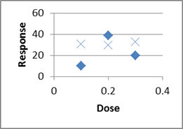
What if we had only done one trial at each dose?
Might see just the diamonds, or just the Xs, leading to two completely different ideas of the trend!
And that's just by doing two rather than one at each level!
Replication allows us to quantify the variability/uncertainty at each level.
Also, when designing, choose 3 or more X values, so we can detect nonlinearity.
Controls: Positive and Negative
Bio/Chem: when trying to detect a chemical in a sample (pollution in a lake?),
run your procedures on some known pure water (Negative Control),
and on some water with a known amount of pollutant deliberately added to it
(Positive Control).
Computer Science: when testing spam-filtering software,
run it on some known non-spam ("ham")--negative control,
and on some known spam -- positive control.
What is the difference between placebo and control?
Placebos are meant to fool _people_--usually unnecessary on non-people.
While control experiments apply to people and non-people alike.
But you should still handle animals in the control group the same way (incl.
surgery?)
This article is a humorous take on experimental vs
observational, etc: How To Argue With Research You Don't Like,
http://www.washingtonpost.com/blogs/wonkblog/wp/2013/09/12/how-to-argue-with-research-you-dont-like/
Chapter 3
Guidelines and debate about information visualization: http://eagereyes.org/blog/2012/responses-gelman-unwin-convenient-posting and http://robertgrantstats.wordpress.com/2014/05/16/afterthoughts-on-extreme-scales/
A “Segmented Bar Chart” in
our textbook is the same as a “100% Stacked” chart in Excel. If you change the
widths of the bars to reflect the counts of each bar, that is called a “Mosaic”
chart by most statisticians, or Fathom calls it a “Ribbon” chart. Here are some
thoughts on how to make them in Excel: here and here
http://asq.org/learn-about-quality/data-collection-analysis-tools/overview/histogram2.html
includes some I haven't seen before expressed in
this way:
* Edge peak. The edge peak distribution looks
like the normal distribution except that it has a large peak at one tail.
Usually this is caused by faulty construction of the histogram, with data
lumped together into a group labeled “greater than…”
* comb distribution: In a comb distribution, the
bars are alternately tall and short. This distribution often results from
rounded-off data and/or an incorrectly constructed histogram. For example,
temperature data rounded off to the nearest 0.2 degree would show a comb shape
if the bar width for the histogram were 0.1 degree.
*heart cut distribution: like Normal but with
upper and lower bounds (only selling products that fall in an acceptable range)
*dog food distribution: what's left after a
heart-cut distribution (only selling products on secondary market that fall
outside acceptable range)
Indian
Standardized Test Histogram
A very interesting data
set/set of histograms, which we would expect to have a Normal distribution like
the SAT or ACT, but it's definitely non-normal in very interesting ways:
(you'll need to scroll down past the description of how he collected the data
in a sneaky way):
http://deedy.quora.com/Hacking-into-the-Indian-Education-System
whereas SAT data can be found at
http://research.collegeboard.org/programs/sat/data
http://research.collegeboard.org/content/sat-data-tables
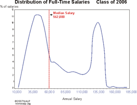
Lawyer starting salaries: (and then 2007 is even worse)
Are adult heights distributed bimodally due to male/female differences?
http://faculty.washington.edu/tamre/IsHumanHeightBimodal.pdf
http://commoncoretools.files.wordpress.com/2012/04/ccss_progression_sp_hs_2012_04_21.pdf
... two ways of comparing height data for males
and females in the 20-29 age group. Both involve plotting the data or data
summaries (box plots or histograms) on the same sale, resulting in what are
called parallel (or side-by-side) box plots and parallel histograms. The
parallel box plots show an obvious difference in the medians and the IQRs for
the two groups; the medians for males and females are, respectively, 71 inches
and 65 inches, while the IQRs are 4 inches and 5 inches. Thus, male heights
center at a higher value but are slightly more variable.
... Heights for males and females have means of
70.4 and 64.7 inches, respectively, and standard deviations of 3.0 inches and 2.6
inches.
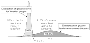
Blood
Sugar Levels [note that the height of the Diabetic peak should be much
smaller in the whole population, like 2% to 5%; this graph is showing two conditional distributions]
Duration of pregnancy has a left-skewed histogram; doi:10.1093/humrep/det297
Birth weight and birth length probably are also left-skewed?
Where the bins start can affect the apparent shape of the
histogram:http://zoonek2.free.fr/UNIX/48_R/03.html
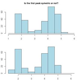
Which histogram below shows more variability, A or B? (adapted from a SCHEMATYC document)
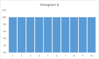
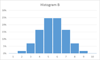
Which time series shows more variability, A or B?
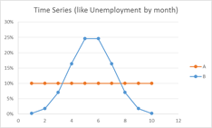
How can we address the mismatch? Focus on understanding and labeling the AXES! (I deliberately didn’t label the axes, above)
Histogram:
x = what values?
y = how many?
Time plot:
x = when?
y = what value?
data sets of quiz scores: which is more variable/harder to
predict?
data set 1: 1 2 3 4 5 6 7 8 9 10; histogram looks flat
data set 2: 8 8 8 8 8 8 8 8 8 8 ; histogram has a spike
Other sample histograms from something I created for my Math
110 class. Here's the link:
http://people.emich.edu/aross15/math110/m110-coursepack-supplement-v6.docx
and just search inside the file for Histogram.
An alternative to a histogram is a Frequency Polygon; these tend to be better when showing two or more histograms on the same graph
Heart Rate Survey Data with Relative Ranks:
https://tuvalabs.com/mydatasets/d24bae4915ee4ad99a99b263f7a7143d/
Classification of Chart Types
http://www.excelcharts.com/blog/classification-chart-types/
-----------------------------------
Melanie Tory and Torsten Moller’s InfoVis 2004
paper “Rethinking Visualization: A High-Level Taxonomy” (search for it at
scholar.google)
http://webhome.cs.uvic.ca/~mtory/publications/infovis04.pdf
------------------------------------------------
Choosing a Good Chart
http://extremepresentation.typepad.com/blog/2006/09/choosing_a_good.html
------------------------------------------------
a task by data type taxonomy for information
visualization.
----------------
don't use rainbow colors for sequential data
values:
http://www.wired.com/2014/10/cindy-brewer-map-design/
http://datascience.ucdavis.edu/NSFWorkshops/Visualization/GraphicsPartI.pdf
http://www.poynter.org/uncategorized/224413/why-rainbow-colors-arent-always-the-best-options-for-data-visualizations/
-----------------------------------------------------
a really good overview:
http://datascience.ucdavis.edu/NSFWorkshops/Visualization/
-----------------------------------------------------
Statistical Graphics for Univariate and
Bivariate Data
William G. Jacoby
Quantitative Applications in the Social
Sciences, #117
A Sage University Paper
page 11
from most accurate to least accurate:
A. Position along a common scale
B. Position along common, nonaligned scales
C. Length
D. Angle* [perceptual judgments abou tangles and
slopes/directions are carried out with equal accuracy, so their relative
ordering in this figure is arbitrary]
E. Slope, Direction* [see above]
F. Area
G. Volume
H. Fill density, Color Saturation
page 23, regarding kernel density estimates:
"In statistical terminology, narrow
bandwidths produce low-bias, high-variance histograms; the density trace
follows the data very closely (low bias), but the smooth curve jumps around
quite a bit (high variance). Larger bandwidths are high bias and low variance
because they produce a smooth density trace (low variance in the plotted
values) but depart from the actual data to a more substantial degree (high bias
in the graphical representation)."
[they must mean variance in the vertical height]
page 52, Construction Guidelines for Bivariate
Scatterplots
mostly from Cleveland 1994
"/Make sure that the plotting symbols are
visually prominent and relatively resistant to overplotting effects/. ... For
example, small plotting symbols are easily overlooked. At the same time, larger
filled symbols make it quite difficult to distinguish overlapping data points.
For these reasons, open circles make good general-purpose plotting symbols for
bivariate scatterplots.
"/Rectangular grid lines usually are
unnecessary within the scale rectangle of a scatterplot/
"/The data rectangle should be slightly
smaller than the scale rectangle of the scatterplot/. Otherwise, it is likely
that some data will be hidden as a result of intersections between points and
the scale lines....
"/Tick marks should point outward, rather
than inward, from the scale lines/. ... further reduces the possibility of
collisions between data points and other elements of the scatter diagram...
and then a few other, less important.
page 85, Aspect ratio and Banking to 45 degrees
https://eagereyes.org/basics/banking-45-degrees
actually argues that the original study didn't
test other possibilities:
"While Cleveland et al. assumed the
precision of value judgments would again decrease when going below 45º, they
did not present actual data to show that.
When testing lower average slopes, Talbot et al.
found that people actually got better with shallower slopes. The 45º were an
artifact of the study design."
Also see:
https://eagereyes.org/section/seminal-papers
-----------------------------------------------------
Chapter 4
A puzzle to start class:
1) What value of x minimizes (x-1)^2 + (x-3)^2 +
(x-8)^2 ?
2) What value of x minimizes abs(x-1) + abs(x-3)
+ abs(x-8) ?
(while you could use calculus on #1, you can't
on #2, so I suggest just graphing both of them)
Doing Data Science, page 270: “the average person on Twitter is a woman with 250 followers, but the median person has 0 followers”
Mythbusters on Standard Deviation: testing different soccer-ball launchers, looking for consistency (dig the spreadsheet out of my email?)
Boxplots: An interesting comparative boxplot on what
different hospitals charge for different blood tests: Variation
in charges for 10 common blood tests in California hospitals: a cross-sectional
analysis by Renee Y Hsia1, Yaa Akosa
Antwi2, Julia P Nath
Figure 1: Variation in charges for 10 common
blood tests in California (CBC, complete blood cell count; ck, creatine kinase;
WCC, white cell count). Central lines represent median charges, boxes represent
the IQR of charges, and whiskers show the 5th and 95th centile of charges for
each of the 10 common blood tests.
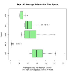
Boxplots: variability in salaries for top 100 athletes in various US sports, from Jeff Eicher via the AP-Stats community:
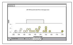
Transitioning from Dotplots to Boxplots: Hat Plots, a math-education-specific way to make the transition; shown in The Role of Writing Prompts in a Statistical Knowledge for Teaching Course by R.E. Groth (draft saved in email); Tinkerplots can do them.
Old Class Data
Here is the data that you entered this semester on your own
height, in inches above 5-foot-0-inches.
We will use this in class.
Not to spoil the fun, but we will:
* make a histogram to see its general shape, in bins of width 2 inches
(use the histogram template file we've been using)
* compute the mean & SD
* compute another histogram with bin widths of 1 SD, centered on the mean
* look at the % of data points within +/- 1 SD of the mean, and then +/- 2 SD
of the mean, and +/- 3 SD.
6
10.5
9
7
10
8
12
0
8
10
5
2
6
10
9.5
4 in
16.5
17
6
9
13
6
11
9
7.75
6
15
2
0.4
4 inches
6
5
14.5
12
3
5-foot-6-inches
4
11
10
11
4.75
6
12
7
8
9
12.5
8
And here's another data set, on how long it took students in one of my
Math 110 classes to walk from Green Lot to Pray-Harrold, in decimal minutes:
9.4166666667
8.35
9.6
10.4666666667
10.5333333333
12.15
7.7666666667
8.1666666667
6.3666666667
6.3666666667
0.1334166667
8.2166666667
7.25
7.3333333333
22.7833333333
7.55
6.5833333333
4.45
7.1
3.7166666667
5.7166666667
11.9833333333
6.2666666667
8.6333333333
5.7
7.25
7.9666666667
7.8833333333
6.766666666
Algorithms for Computing the Mean and the Variance
Surprisingly,
it can be hard to compute the mean, and especially the variance, if there is a
huge amount of data, or if roundoff error is an issue. Computer science people
might want to read:
http://cpsc.yale.edu/sites/default/files/files/tr222.pdf
equivalent to
Chan, Tony F.; Golub, Gene H.; LeVeque, Randall
J. (1983). Algorithms for Computing the Sample Variance: Analysis and
Recommendations. The American Statistician 37, 242-247. http://www.jstor.org/stable/2683386
Also:
http://en.wikipedia.org/wiki/Algorithms_for_calculating_variance
Chapter 5
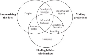
Is the main purpose of regression to make predictions? The book “Making Sense of Data, Volume I” says that statistics is for: making predictions, finding hidden relationships, and summarizing the data:
Here is another take on it: To Explain or to Predict? by Galit Shmueli
Forecasting time series data is an important statistics
topic that we don’t have time to do in detail. Here is a freely available
textbook chapter about it: “Chapter 16: Time Series and Forecasting”
http://highered.mcgraw-hill.com/sites/dl/free/0070951640/354829/lind51640_ch16.pdf
There are more types of regression than what we’ll learn
about. See 10 types of regressions.
Which one to use?
For future teachers: Unofficial TI-84
regression manual, or another site. It
mentions that you need to turn on the Calculator Diagnostics to get the r and
r^2 values. Do that by doing [2nd] [Catalog] [D] [Diagnostic On]
[Enter]; you should only have to do that once in the lifetime of the calculator
(unless you do a full-reset?)
And, it’s important to be able to compute and plot residuals.
Here are
instructions for doing it on a TI-84.
also should include:
If you accidentally delete List1, then do this:
Stat -> Stat Editor -> (enter) ->
(enter)
Here's an animation of what it means to have a bell-curve
distribution of the residuals:
http://screencast.com/t/w7YOge93Nj
This could help in understanding the first few
sheets on the pre-work for classtime
Example Plots
Here is an example
heteroscedastic scatter plot: x=income, y=Expenditure on food, both
in multiples of their respective mean; this is UK data on individuals, from
1968-1983
![\includegraphics[scale=0.7]{ANRfoodscat.ps}](m360-supplement-2015-fall_files/image023.jpg)
Here is some data on
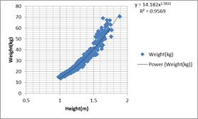
school-age children in the US, height and weight, that also shows heterskedasticity:
data from http://www.nal.usda.gov/fnic/DRI/DRI_Energy/energy_full_report.pdf
There are various tests for heteroscedasticty:http://en.wikipedia.org/wiki/Breusch%E2%80%93Pagan_test
An example Matrix of Scatterplots, from Statistical Methods in Psychology Journals:

It’s data from a national survey of 3000 counseling clients (Chartrand 1997); on the diagonal are dotplots of the individual variables, and off the diagonal there are scatterplots of pairs of variables. “Together” is how many years they’ve been together in their current relationship. What do you see in these plots?
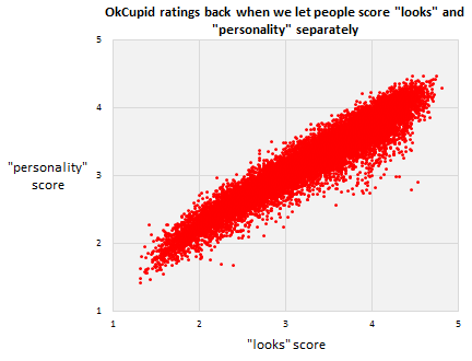
Here’s a fun/depressing scatterplot, from OK Cupid: http://blog.okcupid.com/index.php/we-experiment-on-human-beings/
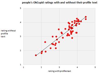
And then [in the following paragraph, what does the “less than 10%” mean, in terms of statistical things like slope, intercept, correlation coefficient, R^2, etc?]
After we got rid of the two
scales, and replaced it with just one, we ran a direct experiment
to confirm our hunch—that people just look at the picture. We took a small
sample of users and half the time we showed them, we hid their profile text.
That generated two independent sets of scores for each profile, one
score for “the
picture and the text together” and one for “the picture alone.” Here’s how
they compare. Again, each dot is a user. Essentially, the text is less than 10%
of what people think of you.
Correlation and Causation
Doing Data Science, page 26:
Say you decided to compare women and men with the exact same
qualifications that have been hired in the past, but then, looking into what
happened next you learn that those women have tended to leave more often, get
promoted less often, and give more negative feedback on their environments when
compared to the men. Your model might be likely to hire the man over the woman
next time
the two similar candidates showed up, rather
than looking into the possibility that the company doesn’t treat female
employees well. In other words, ignoring causation can be a flaw, rather than a
feature. Models that ignore causation can add to historical problems instead of
addressing them.... And data doesn’t speak for itself. Data is just a
quantitative, pale echo of the events of our society
Also see the fantastical claims in “The End of Theory: The Data
Deluge Makes the Scientific Method Obsolete” Chris Anderson, Wired, 2008
And, Statistical Truisms in the Age of Big Data by Kirk Borne
Can this data tell us
anything?
http://www.deathpenaltyinfo.org/murder-rates-nationally-and-state#MRalpha
Logarithms
Grab data for
infant mortality vs. gdp-per-capita from my email box?
Starbucks data: http://textbookequity.org/oct/Textbooks/Lippman_mathinsociety.pdf
Year Number of Starbucks stores
1990 84
1991 116
1992 165
1993 272
1994 425
1995 677
1996 1015
1997 1412
1998 1886
1999 2498
2000 3501
2001 4709
2002 5886
2003 7225
2004 8569
2005 10241
2006 12440
2007 15756
http://www.starbucks.com/aboutus/Company_Timeline.pdf retrieved May 2009
Like Moore’s law, but for LEDs: http://en.wikipedia.org/wiki/Haitz's_law
Range of human
hearing and range of human vision:
http://eagereyes.org/blog/2012/values-worth-chart
Double-Log
scales:
http://robertgrantstats.wordpress.com/2014/05/16/afterthoughts-on-extreme-scales/
http://en.wikipedia.org/wiki/Graphical_timeline_from_Big_Bang_to_Heat_Death
Regression to the Mean
http://en.wikipedia.org/wiki/Regression_to_the_mean
The Rhine
Paradox, about testing for ESP
http://support.sas.com/resources/papers/proceedings10/271-2010.pdf
http://onlinestatbook.com/stat_sim/reg_to_mean/
http://books.google.com/books?id=NcFOwRCwDOQC&lpg=PA252&ots=QJJ87auCoA&dq=%22regression%20toward%20the%20mean%22%20data%20set&pg=PA251#v=onepage&q=%22regression%20toward%20the%20mean%22%20data%20set&f=false
http://isites.harvard.edu/fs/docs/icb.topic469678.files/regress_to_mean1.pdf
http://codeandmath.wordpress.com/2012/11/21/regression-to-the-mean/
http://www.stat.berkeley.edu/~bradluen/stat2/lecture12.pdf
This page points out the problem of doing repeated tests as the sample
size grows--even if H0 is true, the P value will wander between 0 and 1
randomly, and if you decide to stop when it hits 0.05 you're doing something
bad: http://www.refsmmat.com/statistics/regression.html
Why best cannot last: Cultural differences in predicting regression
toward the mean
http://onlinelibrary.wiley.com/doi/10.1111/j.1467-839X.2010.01310.x/abstract
Roy R. Spina, Li-Jun Ji, Michael Ross, Ye Li, Zhiyong Zhang
Article first published online: 16 AUG 2010; DOI:
10.1111/j.1467-839X.2010.01310.x
Keywords: culture; lay theories of change; prediction; regression toward the
mean
Four studies were conducted to investigate cultural differences in predicting
and understanding regression toward the mean. We demonstrated, with tasks in
such domains as athletic competition, health and weather, that Chinese are more
likely than Canadians to make predictions that are consistent with regression
toward the mean. In addition, Chinese are more likely than Canadians to choose
a regression-consistent explanation to account for regression toward the mean.
The findings are consistent with cultural differences in lay theories about how
people, objects and events develop over time.
Home Run Derby. There
is a popular view that players who participate in the Home Run Derby somehow
"hurt their swing" and do worse in the second half of the season.
This article talks about how this phenomenon can be accounted for by regression
to the mean.
http://fivethirtyeight.com/datalab/the-home-run-derby-myth/
Ecological Fallacy
http://en.wikipedia.org/wiki/Ecological_fallacy
http://www.jerrydallal.com/LHSP/corr.htm
try google images for:
ecological fallacy
http://ehp.niehs.nih.gov/1103768/
Three Criteria for Ecological Fallacy
Alvaro J. Idrovo
mentions/has a diagram for
ecological fallacy
atomistic fallacy
sociologistic fallacy
psychologistic fallacy
Interpreting
the Intercept
Interpreting the Intercept in a
Regression Model
http://www.theanalysisfactor.com/interpreting-the-intercept-in-a-regression-model/
and the more advanced “How to Interpret the
Intercept in 6 Linear Regression Examples”
http://www.theanalysisfactor.com/interpret-the-intercept/
Interpreting the Slope
http://blog.mathed.net/2012/07/settling-slope-and-constructive-khan.html
Working on her dissertation in the mid-1990s,
Sheryl Stump (now the Department Chairperson and a Professor of Mathematical
Sciences at Ball State University) did some of the best work to date about how
we define and conceive of slope. Stump (1999) found seven ways to interpret
slope, including: (1) Geometric ratio, such as "rise over run" on a
graph; (2) Algebraic ratio, such as "change in y over change in x";
(3) Physical property, referring to steepness; (4) Functional property,
referring to the rate of change between two variables; (5) Parametric
coefficient, referring to the "m" in the common equation for a line
y=mx+b; (6) Trigonometric, as in the tangent of the angle of inclination; and
finally (7) a Calculus conception, as in a derivative.
[note that none of these correspond
to how we view slope in statistics!]
Thinking about how to measure R^2:
eight criteria for a good R2, mentioned at http://statisticalhorizons.com/r2logistic
Kvalseth, T.O. (1985) “Cautionary note about
R2.” The American Statistician: 39: 279-285
Chapter 6
Activity idea: Determine the
sensitivity and specificity of the Cinderella shoe-fitting method. You will
have to make some assumptions.
How can you analyze this study?
http://www.healthline.com/health-news/children-autism-risk-appears-early-in-the-placenta-042513
Autism Risk Detected at Birth in Abnormal
Placentas
Written by Julia Haskins | Published April 25,
2013
Some good
sensitivity/specificity examples at http://onlinelibrary.wiley.com/enhanced/doi/10.1111/1467-9639.00076/
More stuff about
sensitivity and specificity:
http://www.npr.org/templates/transcript/transcript.php?storyId=407978049
http://www.npr.org/sections/money/2015/05/20/407978049/how-a-machine-learned-to-spot-depression
http://www.theatlantic.com/technology/archive/2014/05/would-you-want-therapy-from-a-computerized-psychologist/371552/
http://ict.usc.edu/prototypes/simsensei/
Chapter 6.7:
Estimating Probabilities Empirically Using Simulation
http://commoncoretools.files.wordpress.com/2011/12/ccss_progression_sp_68_2011_12_26_bis.pdf
students should experience setting up a model
and using simulation (by hand or with technology) to collect data and estimate
probabilities for a real situation that is sufficiently complex that the theoretical probabilities are not
obvious. For example, suppose, over many years of records, a river generates a
spring flood about 40% of the time. Based on these records, what is the
chance that it will flood for at least three years in a row sometime
during the next five years? 7.SP.8c
7.SP.8c Find probabilities of compound events
using organized lists, tables, tree diagrams, and simulation.
c Design and use a simulation to generate
frequencies for compound events.
Chapter 7
We might also have a quick quiz in class about how shifting
or scaling affects the mean, variance, SD, IQR, etc., and the proper formula
for the sample variance.
In class, we used the dotplot-histogram-crf-1000 sheet to investigate questions
like:
* Is E[X+Y] = E[X] + E[Y] ? (yes, it always is--doesn't even need
independence!)
* Is Std(X+Y) = Std(X) + Std(Y) ? (no, it basically never is!)
* Is Var(X+Y) = Var(X) + Var(Y) ? (in Excel it was close enough; with infinite
trials, it's exactly true,
but we need to require that X and Y be independent, or at least uncorrelated)
Some other questions we could ask:
* Is E[X^2] = ( E[X] )^2 ?
* Is E[1/X] = 1/ E[X] ?
* Is E[X*Y] = E[X]*E[Y] ?
If you look at the 2nd multi-plotting sheet inside that file I sent, you
will see a copy of what we did today, and some experiments as suggested
above.
In other news, here is some advice on keeping notation straight:
http://heather.cs.ucdavis.edu/~matloff/132/PLN/ProbStatBook.pdf
Page 15:
Do not write/think nonsense. For example: the expression "P(A) or
P(B)" is nonsense--do you see why? Probabilities are numbers, not boolean
expressions, so "P(A) or P(B)" is like saying, "0.2 or 0.5"
-- meaningless.
Similarly, say we have a random variable X. The "probability" P(X) is
invalid. P(X = 3) is valid, but P(X) is meaningless.
Please note that = is not like a comma, or equivalent to the English word
therefore. It needs a left side and a right side; "a = b" makes
sense, but "= b" doesn't.
Similarly, don't use "formulas" that you didn't learn and that are in
fact false. For example, in an expression involving a random variable X, one
can NOT replace X by its mean. (How would you like it if your professor were to
lose your exam, and then tell you, "Well, I'll just assign you a score
that is equal to the class mean"?)
And, from Rossman and Chance, "Brief Review of Set Operations and
Properties":
An event is a set, while a probability is a number.
One calculates probabilities of events (and therefore of sets), but
probabilities are numbers. The following _meaningless_ statements are examples
of nonsensical confusions of sets and numbers:
P(A) intersect P(B)
(P(A))'
P(1-A)
P(A+B)
Examples of _meaningful_ statements about events and probabilities include:
P(A intersect B)
P(A')
1-P(A)P(B)+P(B)
Chapter 7.5: Binomial and Geometric
first, note that an “unfair coin” is apparently nearly impossible to construct:
“You Can Load a Die, But You Can’t Bias a Coin”, Andrew Gelman and Deborah Nolan,
http://www.stat.columbia.edu/~gelman/research/published/diceRev2.pdf
How reliable is public transit? This government
document says “train must stop short of an authority limit with
a 0.999995 certainty”; that means it shouldn’t go past a point on the track
that it isn’t allowed to go past.
Classic question: if you flip a (unfair?) coin n
times, how many times will it come up heads?
The # of heads has a Binomial distribution.
2nd classic questions: if you flip a (unfair?)
coin _until_ you get your first heads,
how many flips will it take?
The # of flips has a Geometric distribution.
Binomial has a fixed # flips, random #heads
Geometric has a random #flips, fixed #heads
(just 1)
We already saw: P(1 energy-efficient fridges out
of 3)
involved 3 different outcomes (3 trials, choose
1 E fridge)
Binomial PMF: one thing Prof. Casey has
identified as
"something to know cold"!
Book uses p(x) but then also uses p for success
probability--dangerous!
nCx * p^x * (1-p)^(n-x); x=0,1,..., n
Binomial PMF applet:
http://www.distributome.org/js/calc/BinomialCalculator.html
Example problems:
n=10 fair coin flips (p=1/2), P(X=5)?
0.24609375
Can use BINOMDIST(x,n,p, false) for PMF in Excel
What about P(X<=3 )?
Could do P(X=0)+P(X=1)+P(X=2)+P(X=3)
but there's a better way: binomdist using the
cumulative=true option:
BINOMDIST(x,n,p,true) = P(X<=x )
0.171875
What about P(X>7)? There's no
reverse-cumulative option.
Instead, say: P(X>7) is the opposite of
P(X<=7: P(X>7)=1-P(X<=7)
then do 1-binomdist(7,n,p,true)
What about P(X>=7) ? Change to X>6, then
use 1-P(X<=6)
How about P(3 < X <= 8)? Change to
P(X<=8) - P(X<=3)
Mean & Standard Deviation:
If you flip a 60% coin 10 times, how many H do
you expect? 6, of course.
So mean # of successes is E[X]=n*p
StdDev isn't so obvious. Var(X)=n*p*(1-p)
This is much more useful in Chapter 7.8,
Binomial Approximations.
Geometric:
# of FLIPS until success:
P(X=x) = failure on x-1 flips, success on 1 flip
= (1-p)^(x-1) * p
x=1,2,3,...
Some books call this the G1 distribution since
it starts at x=1.
If we asked # FAILURES, not #FLIPS, that would
start at x=0, call it G0.
(PMF is slightly different)
Wikipedia shows both types:
http://en.wikipedia.org/wiki/Geometric_distribution
P(X<=x)=1-P(X>x)=1-P(x failures at
start)=1-(1-p)^x
No equivalent function in Excel.
Geometric distribution applet:
http://www.distributome.org/js/calc/GeometricCalculator.html
Book skips: Mean & Var for Geom
If each coin flip has a 1-in-10 chance of H, how
many flips until H?
10 is the obvious answer, and it's right: E[X] =
1/p
Var(x)=(1-p)/p^2
Big important property of Geometric
distribution: Memoryless!
If E[X]=10 and we're already on flip #8 without
a H, E[#remaining flips]=10
not 10-8=2
Things that might have a
Geometric distribution: # children per family? #dogs or #cats per family? #pets
per family? #people per car? #marriages per person? # officers at each rank of
the military (2nd Lt, Lt, captain, major, lt. Colonel, Cl, 1-star general,
etc.), or similarly for enlisted? #dancers left in SYTYCD callbacks? (data in
my email box)
Chapter
7.6: Normal Distribution
If you want to see the formula for the bell
curve, visit
http://en.wikipedia.org/wiki/File:10_DM_Serie4_Vorderseite.jpg
We hardly ever use that formula in Stats class,
though, other than to graph it and shade in some areas so we can see what we
are doing.
Start with Standard Normal: mean=0, stddev=1
This is so special it gets its own letter: z
instead of x
(we already calculated z-scores; it's not a
coincidence!)
Cumulative Distribution
Functions: this applet draws the cumulative area under the curve:
https://www.desmos.com/calculator/auhxppbg8c
Or a more old-fashioned applet, http://www.flashandmath.com/mathlets/calc/antplot/antplot.html
1/sqrt(2*pi)*e^(-x^2/2)
y range on f(x) to [0,0.4]
x range on f(x) to [-3,3]
F(-3) = 0.0013
It's hard to compute something like P(Z<=1)
from scratch, so we use tables or Excel formulas.
Shade area on bell curve for Z<=2, look up in
table,use Excel formula =normdist(2,0,1,true)
And highlight on CDF graph.
Now try for P(-0.5 < Z < 0.5)
Now backwards: what z cutoff gives P(Z<=z) =
0.80 ?
And double-backwards: what z cutoff gives P(-z
< Z < z)=0.95 ?
Non-Standard distributions: translate to
z-scores and back.
On the graph printouts, write in x values next
to z values.
Speeds on a particular road average 40 mph,
sigma=5
What % of speeds are under 45?
What % of speeds are between 30 and 50 ?
Normal Distribution applet:
http://www.distributome.org/js/calc/NormalCalculator.html
(the autoscaling makes it near-worthless
because it always looks the same,
but that's kind of the point!)
Excel: for finding Pr from cutoff,
=normdist(cutoff, mean, std, true)
For finding cutoff from Pr, use =norminv(prob,
mean, std )
Chapter
7.7: Checking for Normality, and Normalizing Transformations
Big initial notice: don't sweat the details of
the formulas here, since each book and software package does things a little
differently.
Normal probability Plot, also called Q-Q
(Quantile-Quantile) plot for Normal
Basic idea: could make a CRF plot directly from
data (no binning), then overlay a NormalCDF plot. But it's hard to tell how
well two CURVES match. So we plot x=exact Normal quantiles, y=data quantiles,
which should make a straight line if the distribution is Normal.
Show Q-Q plot in existing Excel file; don't
construct by hand in class!
If the data isn't Normal, sometimes we transform
it
(take sqrt, cubert, or log) to see if that makes
it more normal.
Some people say that stock market returns are
normal once you take logs:
Ln(price today / price
yesterday)
This is called a LogNormal distribution.
Read in the book: using correlation coefficient
to decide if it's reasonably close to linear.
Doing Data Science, page 31,
figure 2-1, shows a collection of various distributions. They left out
highly-skewed distributions like Pareto, and Gamma or Weibull with CV > 100%
(so skewed their PDF graph has a vertical asymptote at x=0, rather than
touching the y-axis).
Chapter
7.8: Approximating Binomial with Normal
Important intuition:
We noticed that the Binomial distribution often
looked bell-curve-shaped.
So we could approximate Binomial probabilities
with Normal probs.
Match the mean & the StdDev.
mean = n*p, stddev = sqrt(n*p*(1-p) )
P( a < Binom(n,p) < b ) approx= P( a <
Normal < b)
For instance: flip 1000 times with p=0.4
mean=1000*0.4=400, std=sqrt(1000*0.4*0.6)=
15.4919333848297
Pr( Binom within +/- 15 of mean of 400?)
Exact:
=binomdist(400+15,1000,0.4,true)-binomdist(400-15,1000,0.4,true)
Google Docs spreadsheet gives an overflow error:
#NUM!
name-brand Excel gives
0.666757849
Normal Approximation:
=normdist(400+15,400,15.49,true)-normdist(400-15,400,15.49,true)
0.667138730035761
Less-important, detail-oriented stuff: using
< versus <=, and the Continuity Correction.
binomial approximations applet: http://www.jsc.nildram.co.uk/examples/sustats/normalapproximations/NormalApproximationsApplet.html
Chapter 8: Sampling
Distributions
The answer to problem 8.25 (interracial couples) in the back
of the book has a typo. It lists the mean of phat as 0.65 or 65%, when it
should be 0.07 or 7% as stated in the problem for the population. The 65% comes
from the answer to the previous problem, 8.24--it was a copy/paste error.
Is N=1 useful?
Doing Data Science, page 26:
At the other end of the spectrum from N=ALL, we have n=1, by which we
mean a sample size of 1. In the old days a sample size of 1 would be
ridiculous; you would never want to draw inferences about an entire population
by looking at a single individual. And don’t worry, that’s still ridiculous.
But the concept of n=1 takes on new meaning in the age of Big Data, where for a single person, we actually can record tons of information
about them, and in fact we might even sample from all the events or actions
they took for example, phone calls or keystrokes) in order to make inferences
about them. This is what user-level modeling is about).
But it's false that we wouldn't draw inferences about an
entire population based on n=1. n=1 is infinitely better than n=0, if you have
no prior information.
Examples where n=1 is important:
A new restaurant opens. You haven't read
anything about it, but your friend tried it and hated it (or liked it).
More serious: In a Phase 1 (safety) medical
trial, suppose that the first patient you give it to has a horrible reaction
and dies immediately. Would you say “well n=1 doesn’t mean anything, let’s give
it to the next person”?
E[X_1]= mu, no matter what.
n=1 lets you estimate
the mean but not the spread.
n=2 lets you estimate the spread (very poorly,
but at n=1 it's impossible).
n=3 lets you estimate the skew (again, very
poorly, but at n=2 it’s impossible to estimate skew)
n=4 lets you estimate the kurtosis (again, very
poorly…)
Effect of increasing sample size on a boxplot: Start with a
simple box-and-whisker plot, perhaps 50 data points, roughly symmetric. What
will it look like if we take 10-times as much data?
The box edges will:
a)
not systematically change
b)
move much closer to the median
c)
move farther away from the median
The whiskers will:
a)
not systematically change
b)
get longer
c)
get shorter
Class examples
We'll use the
“billionaire-dotplot-histogram-crf-1000” in file in class.
We'll also use these applet pages:
http://www.stat.auckland.ac.nz/~wild/WPRH/index.html
Sampling distribution: (the javascript version, no java
problems!)
http://onlinestatbook.com/stat_sim/sampling_dist/index.html
Headlines
about how charter schools are the best and the worst:
http://bridgemi.com/2015/02/charters-flood-top-and-bottom-of-academic-state-champs-rankings/
http://bridgemi.com/2014/01/searchable-database-academic-state-champs/
A very good
article on why it’s important that the standard error falls inversely with
sqrt(n) :
http://nsmn1.uh.edu/dgraur/niv/TheMostDangerousEquation.pdf
Below, I'm including some text about sampling distributions
from a different book. Please read it.
from
"Workshop Statistics, 4th Edition" by Rossman and Chance:
Topic 13: Sampling Distributions: Proportions
page 278
Watch Out!
*The concept of sampling distribution is one of the most difficult statistical
concepts to firmly grasp because of the different "levels" involved.
For example, here the original observational units are the candies, and the
variable is the color (a categorical variable). But at the next level, the
observational units are the samples, and the variable is the proportion of
orange candies in the sample (a quantitative variable). Try to keep these
different levels clear in your mind.
[to Math 360 students: we will see this categorical/quantitative split in
Chapter 8.3; it's not so apparent in Chapter 8.1 and 8.2]
* It's essential to distinguish clearly between parameters [math 360: our book
calls them population characteristics] and statistics. A parameter is a fixed
numerical value describing a population. Typically, you do not know the value
of a parameter in real life, but you may perform calculations assuming a
particular parameter value. On the other hand, a statistic is a number
describing a sample, which varies from sample to sample if you were to
repeatedly take samples from the population.
* Notice that the Central Limit Theorem (CLT) specifies /three/ things about
the distribution of a sample proportion [and also about a sample mean]: shape,
center (as measured by the mean), and spread (as measured by the standard
deviation). It's easy to focus on one of these aspects and ignore the other
two. As with other normal distributions, drawing a sketch can help you to visualize
the CLT.
* Ensure that these conditions hold before you apply the CLT: the sample needs
to have been chosen randomly, and the sample size condition requires that
n*pi>=10 and n*(1-pi)>=10 [math 360: we say n*p>=10 and
n*(1-p)>=10]. ... it's the normal shape that depends on this
condition. The results about the mean and standard deviation hold regardless of
this condition.
* Notice that the sample size, relative to the value of the population
parameter, is a key consideration when prediction whether or not the sampling
distribution will be approximately normal. However, changing the sample size is
in no way changing the parameters or shape of the categorical population
distribution!
* As long as the population size is much larger than the sample size (say, 20
times larger), the /population/ size itself does not affect the behavior of the
sampling distribuiton. This sounds counterintuitive to most people, because it
means that a random sample of size 1000 from one [US] state will have the same
sampling variability as a random sample of size 1000 from the entire country
(with the same population proportion). But think about it: if chef Julia
prepares soup in a regular-sized pot and chef Emeril prepares soup in a
restaurant-sized vat, you can still learn the same amount of information about
either soup from one spoonful. You don't need a larger spoonful to decide
whether you like the taste of Emeril's soup.
* As we've said before, try not to confuse the sample size with the number of
samples. The sample size is the important number that affects the behavior of
the sampling distribution. In practice, you only get one sample. We have asked
you to simulate a large number of samples only to give you a sense for how
sample statistics vary under repeated sampling; we have tried to ask for enough
samples (typically 500 or 1000) to give you a sense of what would happen in the
long run. In fact, now that you know the Central Limit Theorem's description of
how sample proportions vary under repeated sampling, you no longer need to
simulate taking many samples from the population.[AMR1]
Simpson’s Paradox supplemental reading:
From Jeff Witmer
at Oberlin: http://new.oberlin.edu/dotAsset/1801848.ppt
From Tom Moore at Grinnell: http://www.math.grinnell.edu/~mooret/reports/SimpsonExamples.pdf
And an article that’s very good for pre-service teachers: Representations of Reversal: An Exploration of Simpson's Paradox by Lawrence Mark Lesser, http://www.statlit.org/PDF/2001LesserNCTM.pdf
Also, this article discusses the possibility of a “Double Simpson’s Paradox”, and then it turns out that such a thing is impossible: Friedlander, Richard, and Stan Wagon. "Double Simpson's Paradox." Mathematics Magazine 66 (October 1993): 268
Other related paradoxes: Lord's Paradox ; Kelley's Paradox and Lord's Paradox
Simpson's
Paradox, Lord's Paradox, and Suppression Effects are the same phenomenon – the
reversal paradox, Yu-Kang Tu, David Gunnell and Mark S Gilthorpe
Help on Problem 8.14:
A student asked me for more
guidance on homework 8 #8.14, where I ask you to draw a picture of the sampling
distribution (on paper, or however you want--no need to turn it in).
To give some examples of what I was imagining, I
went and drew curves from our class examples (rather carefully) and they are in
the file “m360-sampling-distribution-drawings.xls” . You don't have to do them
this carefully at all--you could just freehand them.
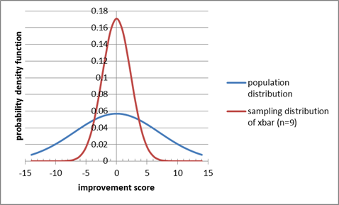
I added an illustration of which probabilities
we were computing by freehanding stuff in Microsoft Paint. Again, you don't
have to do that.
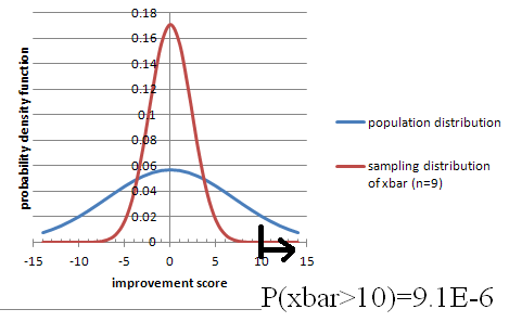
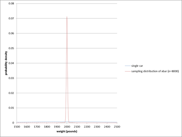
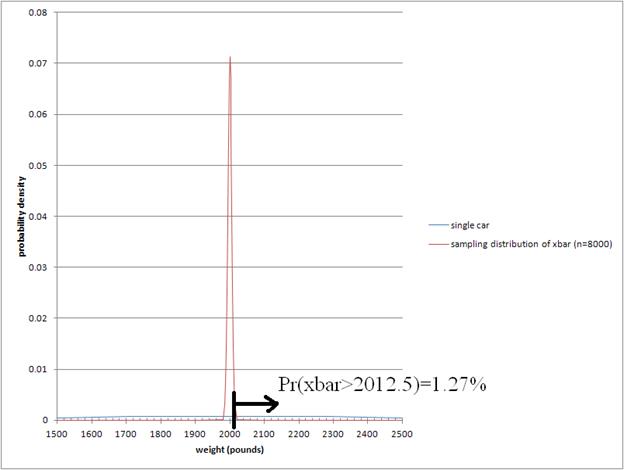

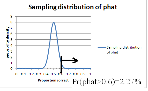
Chapter 9
First, we'll use the "estimators" file that is attached.
Later, we'll use this applet:
http://lock5stat.com/statkey/bootstrap_1_cat/bootstrap_1_cat.html
Near the end of class, we'll use:
http://www.rossmanchance.com/applets/ConfSim.html
(this applet uses JavaScript instead of Java, so
it should work on more machines)
Algebraic proof of why we use n-1 in sample variance:
http://pascencio.cos.ucf.edu/classes/Methods/Proof%20that%20Sample%20Variance%20is%20Unbiased.pdf
http://en.wikipedia.org/wiki/Bessel%27s_correction
Khan Academy videos and applets on use of n-1 in
sample variance:
https://www.khanacademy.org/math/probability/descriptive-statistics/variance_std_deviation/v/simulation-showing-bias-in-sample-variance
https://www.khanacademy.org/math/probability/descriptive-statistics/variance_std_deviation/v/another-simulation-giving-evidence-that--n-1--gives-us-an-unbiased-estimate-of-variance
Confidence Intervals Applet
from Peck/Olsen/Devore:
http://www.thomsonedu.com/statistics/book_content/0495118737_peck/misc/SS/Applets/applets2/PeckConfsim.html
Bias vs Variance
Tradeoff
* how much historical information to include when analyzing
things like inflation, stock market, population growth, etc.
- high variance, low bias: only include
recent info
- low variance, high bias: include lots of
history, even though conditions might have changed (new laws about how
government deals with finance markets, etc.)
* doing assessment on a class with only a few math majors
like Calculus I:
- high variance, low bias: only test the math majors
- low variance, high bias: test everyone,
hoping that the non-math-majors are
reasonably similar to math majors
(but then could you look at the difference of
means between math & nonmath to
unbias it? But then you're just using n=#math majors
again)
* Measuring pulse after exercise:
- high variance, low bias: take pulse in
10-second increments
- low variance, high bias: take pulse in
60-second increments (even though you know pulse rate is falling during that
time; if it were falling linearly that wouldn't be biased, but if it's falling
like exponential decay then it's biased low compared to the pulse rate at the
middle of the interval, by Jensen's theorem)
* computing average waiting time or #-in-system
in a queueing system with warmup:
- high variance, low bias: cut out the
warmup data before averaging
- low variance, high bias: include warmup
data in the average
But, Winifred Grassmann paper that says it's
still better to include the warmup period (just in Markovian case?)
* maybe; using median/Ln(2) to estimate the mean
of an Exponential distribution?
- but is that even biased?
http://web.engr.oregonstate.edu/~tgd/classes/534/slides/part9.pdf
Models that fit the data poorly
have high bias:
inflexible models such as linear regression,
regression stumps
Models that can fit the data very well have low
bias but high variance:
flexible models such as nearest neighbor
regression, regression trees
http://www.cs.cornell.edu/courses/cs578/2005fa/CS578.bagging.boosting.lecture.pdf
Good article on more data vs better models, bias vs variance
tradeoff:
http://www.kdnuggets.com/2015/06/machine-learning-more-data-better-algorithms.html
Also, the Norvig article The Unreasonable
Effectiveness of Data (attached)
Caltech lectures on machine learning; this one is about bias vs variance:
https://www.youtube.com/watch?v=zrEyxfl2-a8&hd=1
Confidence Intervals
Other Than 95%
One thing that you could figure out for yourself, but we
might as well highlight here, is how to compute the critical value for
confidences other than 95%. Remember that we want the z-value that gives a 95% central
probability, which means 5% in the tails, or 5%/2 in each tail. To turn a
probability into a z-value, we use NormInv. And we want 5%/2 in the left tail;
this will give us a negative z value, but we want a positive z value. So we can
use
abs(norminv(0.05/2,0,1))
or
abs(norminv( (1-0.95)/2, 0, 1)
The 0 and 1 make it a Standard Normal (mean 0,
SD 1) so we get a truly standard z value.
There are other ways to do it, which I list
below. You could read through them and try to figure out how each works, if
you're the kind of person who likes having multiple ways to do something.
Other ways:
-norminv(0.05/2,0,1) [note: not 1-norminv, just -norminv]
norminv(1-0.05/2,0,1)
norminv(0.95 + 0.05/2,0,1)
Common measures of
Effect Size
difference of means
% difference of means
Cohen's d or Cohen's g : (xbar1 - xbar2)/s , not
using sqrt(n)
difference of risk
relative risk
Odds Ratio
[think about 10% becoming 15%, a 5 pctg. pt.
change but a 50% increase; compare to 1-to-1million vs 1.5-to-1million ]
r
R^2
slope
Chapter 10
Big-Picture skeptical discussion on use of p-values and Hypothesis
Testing
Big disclaimer: almost everything in science uses the basic
idea of this chapter, but it has fundamental problems that most statisticians
acknowledge!
http://www.americanscientist.org/issues/feature/2014/6/the-statistical-crisis-in-science/1
One article
talked about a different measure of significance as “a p-value you can’t
buy”—the idea being that you can always get a better p-value by spending more
money to take a bigger sample.
How to kill your grandmother with statistics, the problem with Null Hypothesis Significance Testing (NHST is okay “if all results are equally good or bad to you, and you have no prior information”)
http://golem.ph.utexas.edu/category/2010/09/fetishizing_pvalues.html
The Earth Is Round ( p<0.05), by Jacob Cohen, https://labs.psych.ucsb.edu/janusonis/skirmantas/cohen1994.pdf
http://quomodocumque.wordpress.com/2013/05/13/tantalisingly-close-to-significance/#comment-16547
Chapter 11.9, page 230 of:
http://heather.cs.ucdavis.edu/~matloff/132/PLN/ProbStatBook.pdf
What's Wrong with Significance Testing and What
to Do Instead
book: The Cult of Statistical Signicance, by S.
Ziliak and D. McCloskey
quotes about HT: http://www.indiana.edu/~stigtsts/quotsagn.html
Leland Wilkinson and the Task Force on
Statistical Inference: Statistical Methods in Psychology Journals
An article from the journal
Nature: Scientific method: Statistical errors
P values, the 'gold standard' of statistical validity,
are not as reliable as many scientists assume.
"Why
Most Published Research Findings Are False" (Ioannidas)
"Most
Published Research Findings Are False—But a Little Replication Goes a Long
Way"
Key words: p-hacking, or p-value hacking
http://www.statsblogs.com/2015/05/29/john-bohannons-chocolate-and-weight-loss-hoax-study-actually-understates-the-problems-with-standard-p-value-scientific-practice/?utm_source=feedburner&utm_medium=feed&utm_campaign=Feed%3A+statsblogs+%28StatsBlogs%29
Lack of statistically
significant difference isn’t the same as proving no difference: http://www.nytimes.com/2015/02/06/upshot/no-more-running-probably-isnt-bad-for-you.html?_r=2&abt=0002&abg=1
https://www.youtube.com/watch?v=5OL1RqHrZQ8
Dance of the P-Values by Geoff Cumming
The New Statistics: Why and How
Geoff Cumming
http://pss.sagepub.com/content/25/1/7.full
(includes a graph of 2 groups with their CI, and
a CI for the difference like we'd want in chapter 11 2-sample t-test for
difference of means)
[ other graph ideas at http://journals.plos.org/plosbiology/article?id=10.1371/journal.pbio.1002128 ]
Against null-hypothesis significance testing (Also from APA,
ironically!)
Kline, R.B. (2004) Beyond Significance Testing.
Reforming Data Analysis methods in Behavioral Research
Washington, D.C.: APA Books
chapter 3: What's Wrong with Statistical
Tests--And Where Do We Go From here
http://www.apastyle.org/manual/related/kline-2004.pdf
There’s Life Beyond .05
Embracing the New Statistics
Share on twitterShare on printShare on
emailShare on facebookMore Sharing Services
By Geoff Cumming
http://www.psychologicalscience.org/index.php/publications/observer/2014/march-14/theres-life-beyond-05.html
http://lesswrong.com/lw/g13/against_nhst/
http://www.indiana.edu/~kruschke/BEST/
http://lesswrong.com/lw/f7t/beyond_bayesians_and_frequentists/
Phrasings
WE NEVER SAY what the probability of H0 itself
is!
That's the Frequentist way. Bayesians are happy
to talk about it.
In a criminal trial, we (the people) want to
show strong evidence of guilt, so Ha = guilty; then H0 = not guilty, which is
not the same as innocent. (though in the French system it's the opposite!)
If the data is unlikely under the supposition of
H0, then we "reject H0" and accept Ha.
BUT if the data isn't particularly unlikely
(supposing H0), then we NEVER NEVER NEVER "accept H0"; we just fail
to reject it. In a criminal trial, we don't declare them innocent, we just fail
to prove that they are guilty.
Hypotheses are about things we DON'T know, like
mu or p or sigma. There's no point having a hypothesis about something we DO
know, like xbar or phat.
Often we reason this way:
I want to show my product is better than the
specification:
Ha : my quality (population % good) >
specified value of p
So what's the opposite?
H0: my quality (population % good) <= that
specified value fo p
BUT: 1) to assume H0 is true we need a specific
value, not just <=,
AND the most conservative thing to do is let it
be as close as possible to what I'm trying to show: =specified value rather
than <specified.
So while H0 often would naturally be a <= or
>= we state & treat it as an =
We can never show that two things ARE equal,
just fail to show that they aren't.
(but maybe we just didn't collect enough data)
Application idea: http://en.wikipedia.org/wiki/Demining Mine flail effectiveness can approach
100% in ideal conditions, but clearance rates as low as 50–60% have been
reported.[16] This is well below the 99.6% standard set by the United Nations
for humanitarian demining.[6]
[6] http://www.mech.uwa.edu.au/jpt/demining/info/what-is.html
Which tail should you pick? Depends on what you're trying to
prove:
my product is better than the standard
this product is worse than the standard.
Example 10.3 is very good!
But note that we might be willing to use the new
treatment even if it is provably less effective than the old, as long as it's a
lot cheaper or has less side effects. BUT you have to decide before you see the
data; if you let your choice be influenced by the data, you won't hit your
confidence/significance level!
Consider Oscar Pistorious (before his murder trial), or any
other para-olympics athlete with prosthetics; to prove that they should be
allowed in the ordinary olympics, should they prove that they aren't better
than others? or prove they aren't worse? Or two-sided?
Wikipedia page on: Testing hypotheses suggested
by the data
http://en.wikipedia.org/wiki/Testing_hypotheses_suggested_by_the_data
One-sided (one-tailed) vs Two-sided (two-tailed)
tests:
If Ha is "this population is better"
than a standard, use > of course,
or use < if Ha is "this population is
worse" than a standard.
Sometimes we just want to show it's _different_
than a standard:
Ha: p not equal to some standard value. This is
called a two-sided or two-tailed test.
Two-sided is the default if you can't decide;
it's safer because its cutoff values are farther away from the hypothesized
value.
What if we really want to
show that the mean IS equal to something, rather than not-equal?
There's no way to do it with hypothesis testing.
Confidence Intervals to the rescue!
Page 585, Example 10.7: null
hypothesis implicitly includes mu<15, but book says includes mu>15 (am I
right on that?)
Here is one way of laying out the 9-step process
in Excel, all in one row (or actually two, one for headings and the other for
numbers/calculations):
definition H0
value of p Ha alpha pop.
Size
(approx) n #successes phat n*p n*(1-p) sample/pop SE
of phat ASSUMING H0 test
statistic z p
value decision
Catch Phrases
"P-value low, the null must
go; P-value high, the null must fly"
another phrase:
http://blog.gembaacademy.com/2007/02/27/hypothesis-testing/
The null hypothesis is the statement of no
change. I always remember it like this, “Ho hum… there is no difference here.”
Conversely, the alternative hypothesis is the
statement of change. Just remember, “a Ha, there is a change!”
“If P is low, Ho must go. If P is high, Ho can
fly.”
Costs of Type I vs
Type II error
has a quote from a prominent (award-winning)
researcher: “most classifiers assume all errors are equally costly, but in
reality this is seldom the case. Not deleting a spam email will cost a fraction
of a second of your attention, but deleting an email from your boss could cost
you your job...The bottom line is, you want to use either a natively
cost-sensitive learner or an algorithm like MetaCost, or your system will be
making a lot of costly mistakes.”
Here’s
another opinion: Type II errors are the ones that get you fired, http://punkrockor.wordpress.com/2014/02/04/type-ii-errors-are-the-ones-that-get-you-fired-the-atlanta-edition/
And,
another way of looking at errors:
Type S: an error in the sign
of an effect
Type M: an error in the Magnitude of an effect
http://www.tandfonline.com/doi/full/10.1080/09332480.2013.868758#.UuFI0_Qo5ok
Type
III (and IV) error
http://en.wikipedia.org/wiki/Type_III_error#Type_III_errors
Power
By convention, we use an alpha (α) level of .05 and a
power of .80 in social science research.
http://www.amstat.org/education/stn/pdfs/STN85.pdf
Also has a table of required sample size to
achieve given alpha and power=0.80 with Cohen's d set to small, medium, large.
Things I Have
Learned (So far); Jacob Cohen; 1990
http://www.stats.org.uk/statistical-inference/Cohen1990.pdf
says:
"for a two-independent-group-mean
comparison with n=30 per group at the sanctified two-tailed 0.05 level, the
probability that a medium-sized effect would be labeled as significant by the
most modern methods (a t test) was only 0.47. Thus, it was approximately a coin
flip whether one would get a significant result, even though, in reality, the
effect size was meaningful)”
“To minimize the maximal expected risk (Neyman-Pearson), the
ratio of alpha to beta should be the inverse of the ratio of type-I to type-II
risks. Hence, If type-II errors are 2x more severe than type-I errors (as one
might argue in a - non-aviation - "pilot" study), one might
convincingly argue, e.g., for level/power of .20/.90. This get's you about the
same sample size as the "conventional" (aka unjustified) .05/80
ratio.”-- Knut Wittkowski; Head, Dept. Biostatistics, Epidemiology,
and Research Design; The Rockefeller
University, via an ASA email list.
How to Read Education Data Without Jumping To Conclusions
http://www.theatlantic.com/education/archive/2014/07/how-to-read-education-data-without-jumping-to-conclusions/374045/
One of the less-obvious items:
3. Does the study have enough scale and power?
Desmos demonstration of power versus significance:
https://www.desmos.com/calculator/qa1zy0yd12
and a way to animate the tradeoff between
significance and power: (click the Play button on the "c" slider):
https://www.desmos.com/calculator/gyej6qxnlc
Reading Prompts for
a Concept-based quiz on CI and HT
Very little calculation is required for this quiz; it's more
about phrasing.
Here are the situations that will be part of the quiz. Each situation
will be followed by 5 options, and you will chose 1 of those 5.
1. Only 33% of students correctly answered a difficult multiple-choice question
on an exam given nationwide. Professor Chang gave the same question to her 35
students, hypothesizing that they would do better than students nationwide.
Despite the lack of randomization, she performed a one-sided test of the
significance of a sample proportion and got a P-value of 0.03. Which is the
best interpretation of this P-value?
2. Researchers constructed a 95% confidence interval for the proportion
of people who prefer apples to oranges. They computed a margin of error of +-
4%. In checking their work, they discovered that the sample size used in their
computation was 1/4 of the actual number of people surveyed. Which is closest
to the correct margin of error?
3. A survey of 200 randomly selected students at a large university found
that 105 favor a stricter policy for keeping cars off campus. Is this
convincing evidence that more than half of all students favor a stricter policy
for keeping cars off campus?
4. In college populations, the annual incidence of infectious
mononucleosis has been estimated to be as many as about 50 cases per 1000
students. A university student health service took a survey of students to test
whether the rate of mononucleosis on their campus is different from this
national rate. With alpha=0.05, they rejected the null hypothesis. Which is the
best interpretation of "alpha=0.05" in this context?
Source: www.aafp.org/afp/20041001/1279.html
5. In a pre-election poll, 51% of a random sample of voters plan to vote
for the incumbent. A 95% confidence interval was computed for the proportion of
all voters who plan to vote for the incumbent. What is the best meaning of
"95% confidence"?
6. Sheldon takes a random sample of 50 U.S. housing units and finds that
30 are owner occupied. Using a significance test for a proportion, he is not
able to reject the null hypothesis that exactly half of U.S. housing units are
owner occupied. Later, Sheldon learns that the U.S. Census for the same year
found that 66.2% of housing units are owner occupied. Select the best
description of the type of error in this situation.
Chapter 11
Here's a video that is meant
for a different textbook, but it's still a good overview of what we've been
looking at recently. It's interesting to note that their requirements for tests
are slightly different: n>40 instead of n>30 for non-normal data, and
n*p>15 in some cases, >10 in others, and >5 in some!
http://bcs.whfreeman.com/statsportal/bps4e/stattutor/chapter%2022/Inferences%20about%20Variables%20Part%20III%20Review.swf
Post-Minus-Pre vs Regression
I had discussed the idea of regression instead of doing
post-pre subtraction with a colleague a few years ago. Then she discussed it
with someone else, who emailed us this suggestion:
… the statistical analysis may have more nuance than a simple difference of
scores. Some people may say that the gain score should be adjusted by the
pre-test, for example. See:
http://wiki.math.yorku.ca/index.php/Statistics:_Gain_scores_vs._residualized_gain_scores
That page talks about ANCOVA (Analysis of Covariance), which is a more
advanced topic than our course has time to tackle (we don't even get to the
simpler version called ANOVA). So don't worry about the details on that,
just think about the general experimental (/observational in some cases) setup
and the questions we're asking. Also see Use
of covariates in randomized controlled trials
GERARD J.P. VAN BREUKELEN and KOENE R.A. VAN DIJK
Testing by Overlapping Confidence Intervals
Wouldn’t it be great if we could skip a 2-sample t-test and just see if the confidence intervals for the two means overlap? It turns out, yes and no:
http://wise.cgu.edu/downloads/CI_Overlap_Instructions.pdf
http://iase-web.org/documents/papers/icme10/Schield.pdf
http://www.cscu.cornell.edu/news/statnews/stnews73.pdf
http://www.statlit.org/pdf/2013-Schield-Confidence-Intervals-Display-6up.pdf
A
Cautionary Note on the Use of Error Bars, by John R. Lanzante
What Data Scientists call A/B Testing
Data Science people use the term A/B testing for what statistics people call a 2-sample t-test or z-test, or sometimes more than 2 samples (in which case statisticians use ANOVA or Chi-squared tests):
http://en.wikipedia.org/wiki/A/B_testing
http://blog.optimizely.com/2010/11/29/how-obama-raised-60-million-by-running-a-simple-experiment/
How Obama Raised $60 Million by Running a Simple Experiment
By Dan Siroker
We tried four buttons and six different media (three images and three videos).
We used Google Website Optimizer and ran this as a full-factorial multivariate
test which is just a fancy way of saying we tested all the combinations of
buttons and media against each other at the same time. Since we had four
buttons and six different media that meant we had 24 (4 x 6) total combinations
to test. Every visitor to the splash page was randomly shown one of these
combinations and we tracked whether they signed up or not.
----------------------------------
http://www.marketingexperiments.com/blog/general/email-marketing-how-ab-testing-raised-500-million-for-obama-for-america.html
-------------------
http://kylerush.net/blog/optimization-at-the-obama-campaign-ab-testing/
Obama campaign: a/b testing
Dec 12, 2012
Optimization was the name of the game for the Obama Digital team. We optimized
just about everything from web pages to emails. Overall we executed about 500
a/b tests on our web pages in a 20 month period which increased donation
conversions by 49% and sign up conversions by 161%. As you might imagine this
yielded some fascinating findings on how user behavior is influenced by
variables like design, copy, usability, imagery and page speed.
What we did on the optimization team was some of the most exciting work I've
ever done. I still remember the incredible traffic surge we got the day the
Supreme Court upheld Obamacare. We had a queue of about 5 ready-to-go a/b tests
that would normally take a couple days to get through, yet we finished them in
just a couple hours. We had never expected a traffic surge like that. We
quickly huddled behind Manik Rathee—who happened to be the frontend engineer
implementing experiments that day—and thought up new tests on the fly. We had
enough traffic to get results on each test within minutes. Soon our colleagues
from other teams gathered around us to see what the excitement was about. It
was captivating to say the least.
Resampling
Some
examples where resampling works but t-tests don’t [includes Fun data sets,
too:
* telling girl scouts their cookie sales will help fund a trip to Disneyland
* time to back out of a parking spot when there is/isn't someone waiting.]
Chapter 12
Here is a chi-squared test for independence calculator:
http://turner.faculty.swau.edu/mathematics/math241/materials/contablecalc/
A point of view that sometimes bar
charts are better than mosaic plots:
http://www.perceptualedge.com/articles/visual_business_intelligence/are_mosaic_plots_worthwhile.pdf
On the NPR radio show "On The Media" on 2014-08-17,
http://www.onthemedia.org/story/cameras-interrogation-room/
UCLA law professor Jennifer Mnookin was talking
about the use of videotaping in police interrogation rooms:
"We do know certain red flags that may be
associated with false confessions. In many of the known false confession cases
, the interrogations were unusually long. But at the same time, lots of true
confessions may come after long interrogations."
What kind of thinking is that?
In class:
Let's see if we can gather some binomial data.
Let's use families with 2 kids (if your family has more than 2, just consider
the first 2).
Go here (but remove the REMOVETHIS first)
https://docs.gooREMOVETHISgle.com/forms/d/1NBh5OpRoXPXQMy1VcpjTIuRKeQ5tryEFI3sIMnAZ5b0/viewform
and enter either GG, GB, BG, or BB.
---------------------------------
Chi-squared stuff:
Desmos calculator that I made to show how the
Chi-squared distribution changes as DoF increases:
https://www.desmos.com/calculator/swmkwk8fyx
Distributome:
http://www.distributome.org/js/calc/ChiSquareCalculator.html
My excel sheet with a slider; might work only on
PCs rather than Macs. Also, requires you to enable macros, which is dangerous
in general but probably safe for this one file.
-------------------------------------
Mythbusters checked if yawns
are contagious: The results:
25%, 4 out of 16, who were not exposed to a yawn, yawned while waiting. Call
this the non-yawn group.
29%, 10 out of 34, who were exposed to a yawn, yawned. Call this the yawn
group.
Is it a statistically
significant difference? How small could
the sample be to be able to detect a 25% vs 29% difference?
-------------------------------------
I'm also attaching two data sets on population
by city or county, that we might have time to analyze in class using Benford's
law:
Log10(1+1/i) for first digit i.
2-sample z-test for proportions but paired (dependent) rather than independent
http://www.uvm.edu/~dhowell/methods8/Supplements/Testing%20Dependent%20Proportions.pdf
https://onlinecourses.science.psu.edu/stat504/node/96
http://home.ubalt.edu/ntsbarsh/business-stat/otherapplets/PairedProp.htm
101 Statistical Tests, 3rd Ed. By Gopal K. Kanji, Page 57,
Test 23 The Z-test for correlated proportions
Chapter 13
We will use the following link in class: Java (not Javascript) applet that resamples
linear regression; it helps explore/explain the concepts from Chapter 13:
http://www.rossmanchance.com/applets/regcoeff/regcoeff.html
Confidence intervals on the regression line, and prediction intervals for new data points:

Testing for linearity:http://en.wikipedia.org/wiki/Lack-of-fit_sum_of_squares
And Evaluation of three lack of fit tests in linear
regression models Journal of Applied
Statistics
Volume 30, Issue 6, 2003
If we fit a line and get a
good R^2, can we say there's a linear trend to the data?
Not really. We should also fit a quadratic (or power, exponential, etc) and
show it's not much better than the mx+b fit.
Why You Shouldn't Conclude "No Effect" from
Statistically Insignificant Slopes:http://www.carlislerainey.com/2012/06/16/why-you-shouldnt-conclude-no-effect-from-statistically-insignificant-slopes/
More on Concluding "No Effect":http://www.carlislerainey.com/2012/06/27/more-on-concluding-no-effect/
Two different ways to bootstrap a regression model
1. Bootstrap data pairs xi = (ci, yi)
2. Bootstrap the residuals ⇒ xi = (ci, ciβˆ + ˆεi1)
http://compdiag.molgen.mpg.de/ngfn/docs/2003/nov/resampling.pdf
Testing for difference of slopes in two data sets:
http://stats.stackexchange.com/questions/13112/what-is-the-correct-way-to-test-for-significant-differences-between-coefficients
http://onlinelibrary.wiley.com/doi/10.1111/j.1745-9125.1998.tb01268.x/abstract
http://www.jstor.org/discover/10.2307/2782277?uid=3739728&uid=2&uid=4&uid=3739256&sid=21103087143891
Calculus Supplement
See that separate file.
Leemis diagram of distributions:
http://www.math.wm.edu/~leemis/chart/UDR/UDR.html
Decision tree of what distribution to use:
http://pages.stern.nyu.edu/~adamodar/New_Home_Page/StatFile/statdistns.htm
College Math Journal, Vol 31 No 4 September 2000: The Lognormal
Distribution
by Brian E Smith and Francis J Merceret
page 259-261
http://classes.soe.ucsc.edu/ams113/Winter03/
classes.soe.ucsc.edu/ams113/Winter03/calc.pdf
http://www.zweigmedia.com/RealWorld/cprob/cprobintro.html
http://cs.gettysburg.edu/~leinbach/DRVTI_Conf/Kellett.PDF
http://www.ncbi.nlm.nih.gov/pmc/articles/PMC2931677/
http://jwilson.coe.uga.edu/EMAT6680Fa06/Sexton/STAT%206070/Web2.html
Activites for Calc-Based Statistics Classes
http://www.mathspace.com/NSF_ProbStat/Teaching_Materials/Primarily_Statistics.htm
Probability Distributions
Used in Reliability Engineering
ftp://meftp.umd.edu/RIAC/Probability%20Distributions%20Used%20in%20Reliability%20Engineering%20V4.pdf
Basic Concepts of Probability
and Statistics for Reliability Engineering; Ernesto Gutierrez-Miravete
http://www.ewp.rpi.edu/hartford/~ernesto/S2007/SMRE/Notes/Review.pdf
Computer Science
Majors
Free books:
http://www.greenteapress.com/thinkstats/thinkstats.pdf, uses Python
http://www.greenteapress.com/thinkbayes/thinkbayes.pdf
https://github.com/CamDavidsonPilon/Probabilistic-Programming-and-Bayesian-Methods-for-Hackers
An Introduction to Statistical Learning, with Applications in R by
James, Witten, Hastie and Tibshirani (Springer, 2013). As of January 5, 2014, the pdf for this book will be available
for free, with the consent of the publisher, on the book website.
Not-free
books:
Probability and Statistics
for Computer Scientists, 2nd edition
Michael Baron
UT Dallas
CRC press
Probability Foundations for Engineers
Joel A. Nachlas
Virginia Tech
CRC press
I asked some professors in our CompSci department what CS majors should get out of Math 360, and here are some of their responses:
FDR: False
Discovery Rate
http://en.wikipedia.org/wiki/False_discovery_rate
seminal paper, cited more than 22,000 times:
Y. Benjamini and Y. Hochberg. Controlling the false discovery rate: a practical
and powerful approach to
multiple testing. Journal of the Royal Statistical Society: Statistical
Methodology 57 (1995), 289-300.
p-values and q-values:
http://www.nonlinear.com/support/progenesis/samespots/faq/pq-values.aspx
-------------------------------------
I think it would be helpful if CS students knew
about density/distribution functions, perhaps with more emphasis on discrete
(but not entirely).
Conditional probability , Bayes rule , joint
densities.
Possible Projects:
Diagnosis: medical, mechanical, really anything.
Use Naive Bayesian Inference
Classification: Naive Bayesian Inference with
MAP estimator - spam/textual filter classifier
Simulation: Monte Carlo techniques, various
types of Markov processes
Hypothesis Testing - did this type of user
interface increase productivity, did that new protocol increase through-put,
etc.
----------------------------
In some cases, it is a bit hard to deconvolute
the stats from the science.
Recommender systems has gone the way of matrix
decompositions, but understanding distributions is definitely important.
Variance, standard deviation, covariance... different forms of
correlation, mutual information. Also, ways of looking at error of prediction
Bioinformatics is a bit different, since it is a
bit more experimental. you see a lot of use of Fisher's exact test for testing
"enrichment" of annotations --- e.g., does a set of n genes found
experimentally include more members who are annotated to appear in the nucleus
than you would expect by chance? Understanding p-values, q-values/FDR is
important.
Bayes rule shows up in several settings.
-----------------------------
Personally, I would think that some Bayesian
inference could be useful. Maybe signal detection theory. Cluster
analysis might fit MATH 360. You would find a
lot of potential projects in artificial intelligence, pattern recognition, and
machine learning, among other areas.
Signal detection theory:
http://psych.hanover.edu/JavaTest/STD/
http://wise.cgu.edu/sdtmod/
http://en.wikipedia.org/wiki/Detection_theory
http://www.cns.nyu.edu/~david/handouts/sdt/sdt.html
Review
Try to make a summary table with these column headings:
|
Row#
|
#samples : 1, 2, >=3 |
means or proportions |
paired or not |
# tails |
CI or HT? |
Excel function |
|
1 |
|
|
|
|
|
|
|
2 |
|
|
|
|
|
|
The following web site shows
you a bunch of statistics scenarios and you click on the statistical technique
that is most appropriate, and get instant feedback. There's one type of test we
haven't talked about, though: ANOVA. When clicking on types of tests to
include, don't click on ANOVA.
http://www-personal.umich.edu/~hamms/spotlight/nts2.html
PS: if you're curious about ANOVA:
" In its simplest form, ANOVA provides a statistical
test of whether or not the means of several groups are all equal, and therefore
generalizes t-test to more than two groups."
http://en.wikipedia.org/wiki/Analysis_of_variance
See the scanned pages with a
lot of good questions, most of which are concept-based. Some notes:
* Only work on the ones that are
multiple-choice; the ones labeled "Investigation" are not part of the
practice test.
* There are occasional problems that require you
to do some statistical calculations, including using z, t, or chi-squared
tables or Excel functions.
* on page 621 of the scanned pages, you may skip
problem C6 (a six-sided die)
* on page 663 of the scanned pages, you may skip
problem C1.
The concept test that we did via emu-online, on
confidence intervals and hypothesis tests, is also very good for you to study
from.
However, the actual test
questions will not be simple alterations of these questions; they will be new
contexts.
The test will also include a few computational
questions; here are some practice problems for those:
A poll of 1000 people found that 53% said they
were Republican and 47% said Democrat (we are ignoring unaffiliated voters). Of
the Republicans, 20% were in favor of a particular new political proposal. Of
the Democrats, 18% were in favor. Do an appropriate statistical analysis; show
all work and reasoning.
In planning for a wind turbine to generate
electric power, a city put up a wind-speed sensor in Location A and collected 7
days of data, with resulting speeds (avg per day, in mph) of:
10 12 11 12 9 9 12
The sensor was then moved to Location B, whose
measurements were then
9 11 13 12 12 9 8
Do an appropriate statistical analysis; show all
work and reasoning. If you need to make any assumptions, write down what you
are assuming.
Chapter XKCD
Null Hypothesis:
http://xkcd.com/892/
Multiple Testing: http://xkcd.com/882/
Frequentist vs Bayesian: http://xkcd.com/1132/
Statistically Significant outlier http://www.xkcd.org/539/
Cell Phones and Cancer: http://www.xkcd.org/925/
Placebo blocker: http://xkcd.com/1526/
Trouble
for Science: http://xkcd.com/1574/